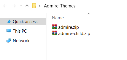
- The theme zip file admire.zip
- Child theme for easier customize in admire-child.zip
- Document in Documentation
Admire Theme
- By: SKT Themes
- Email: [email protected]
- Support: https://admiretheme.com/support/
Thank you for purchasing our theme. If you have any questions that are beyond the scope of this documentation, please feel free to contact us via support.
WordPress General
First of all, to install our theme and run it you need the content management system which is called WordPress.
- Installing WordPress WordPress is well-known for its ease of installation. Under most circumstances, installing WordPress is a very simple process and takes less than five minutes to complete. if you wish to install WordPress yourself, the following guide will help.
- First Steps With WordPress Let’s take a step-by-step tour through your WordPress site and see how the different functions work and how to make your new site your own. During the first part of this tutorial, please don’t change anything within the program unless it is part of the tutorial. After following these steps, you’ll soon be changing everything.
- New To WordPress - Where to Start If you are new to WordPress, here is a step-by-step plan for getting started. If you need help along the way, plenty of options for assistance are listed in this article. Welcome to the exciting world of WordPress!
Theme General
Customizer: With the very powerful innovative WordPress Live Customizer you will be able to preview the changes made to your WordPress website in real time before pushing them live. Lots of options will make it a breeze for you to modify the structure and the visuals of your theme, including color scheme, typography, blog, shop layout, and much more.
Elementor: Elementor is the ultimate WordPress page builder, the key difference is that you can reach a high level of design while designing live and on the front end of your site. Elementor is a page builder plugin that replaces the basic WordPress editor with a live frontend editor, so you can create complex layouts visually, and design your website live, without having to switch between the editor and the preview mode. The page builder enables you to reach a top-notch quality of design without needing to use code or CSS and doesn't require code knowledge.
Gutenberg: Gutenberg is a block-based editor, and introduces a modular approach to modifying your entire site. Edit individual content blocks on posts or pages. Add and adjust widgets. Even design your site headers, footers, and navigation with full site editing support.
Support: If you have any questions that are beyond the scope of this help file, feel free to contact us. We will respond as soon as possible (within 24 – 48 hours, usually faster). We are open from 10am to 7pm (IST), from Monday till Friday.
Files Included
System Requirements
To use Admire, you must be running WordPress 5.6 or higher, PHP7.4 or higher, and MySQL version 5.7 or MariaDB version 10.4 or higher. We have tested it with Mac, Windows and Linux. Below is a list of items you should ensure your host can comply with.
Requirement PHP Configuration Limits
Many issues that you may run into such as: white screen, demo content fails when importing, empty page content and other similar issues are all related to low PHP configuration limits. The solution is to increase the PHP limits. You can do this on your own, or contact your web host and ask them to increase those limits to a minimum as follows:
Memory Size: memory_limit = 256MScript execution time: max_execution_time = 300Script input time: max_input_time = 300Number of input variables: max_input_vars = 5000upload_max_filesize = 32Mpost_max_size = 32MIf you don’t have access to the php.ini file, you can add the following values in your .htaccess file:
php_value memory_limit 256Mphp_value max_execution_time 300php_value max_input_time 300php_value max_input_vars 5000php_value upload_max_filesize 32Mphp_value post_max_size 32MDownload Admire Theme
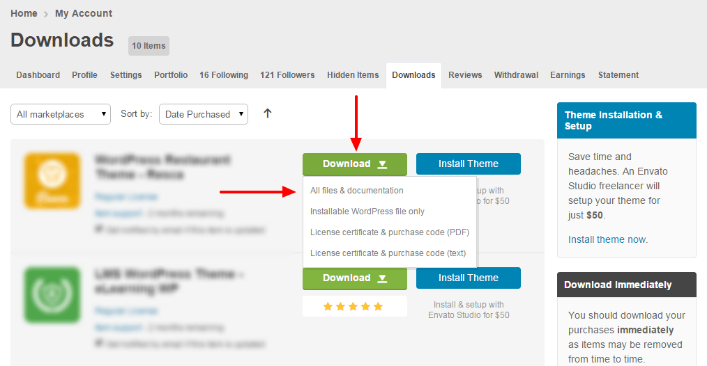
Get the Admire Theme installation package from your account(after login on Themeforest.net) at downloads page and save it to your computer.
Install Admire Theme
Installation via WordPress
Step 1 - Login to your WordPress Dashboard
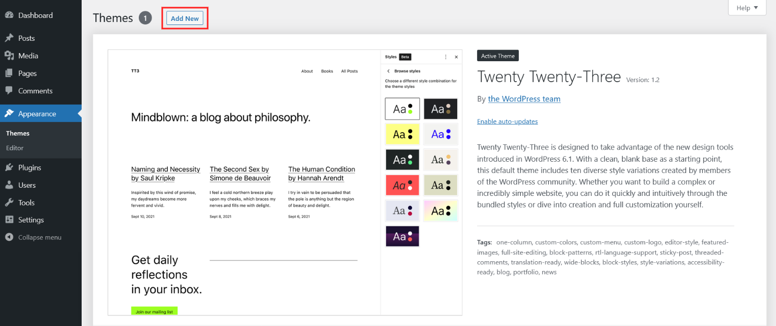
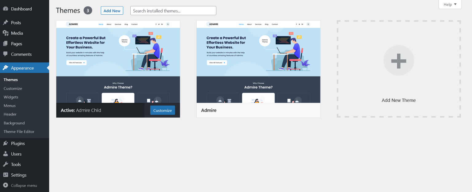
Step 2 - Go to Appearance > Themes. Click the Add New button or Add new theme link. (check screenshot below)
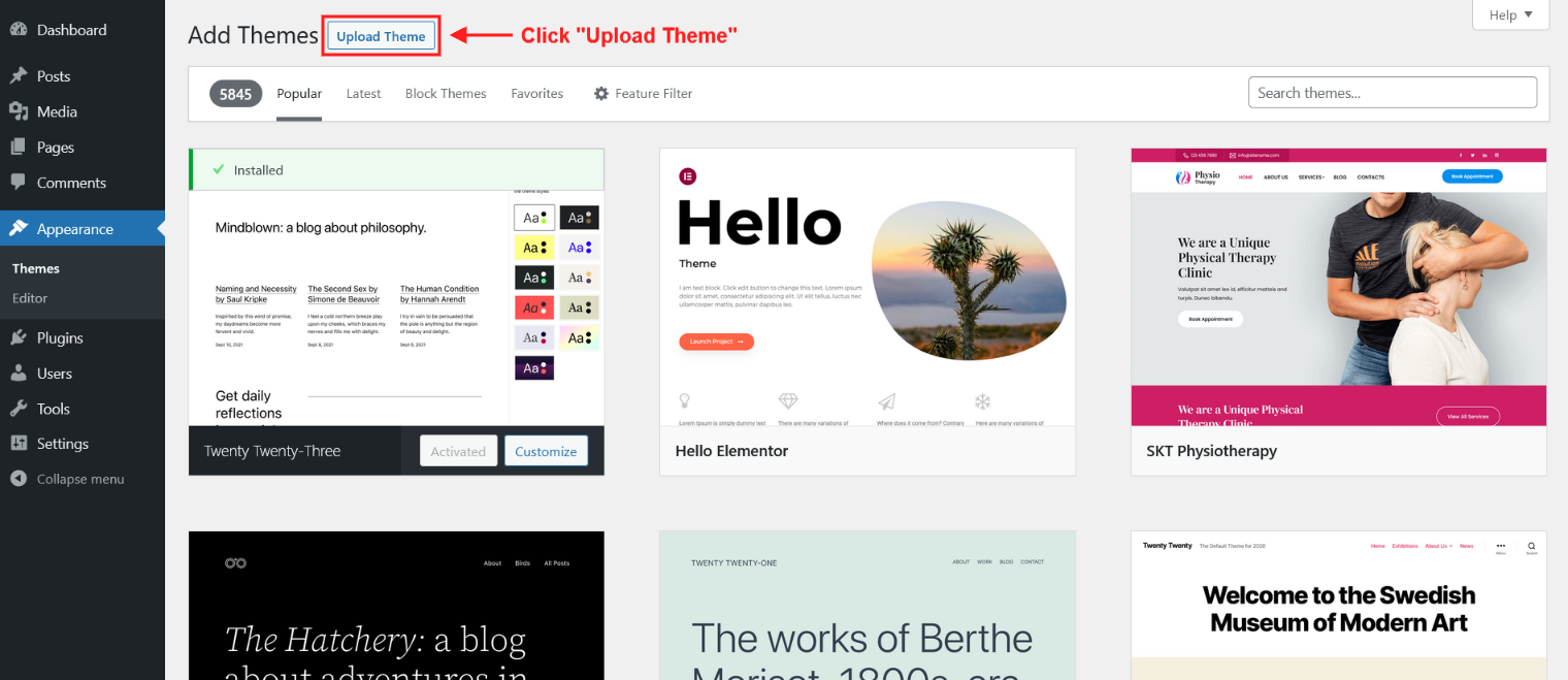
Step 3 - Click on the Upload Theme button. Locate "admire.zip" and click Install Now.
Step 4 - Click on the Activate button to activate Admire. Welcome! Thank you for choosing Admire!. You can now proceed with "Get Started With Admire" .

Installation via FTP
Step 1 - Log into your Hosting server using an FTP client (like FileZilla or WinSCP).
Step 2 - Locate "Admire_Themes.zip" that you found in your ThemeForest Package and unzip it somewhere on your hard drive. Once it is unzipped it will look like a folder named Admire_Themes with all theme files in it.
Step 3 - Locate your WordPress installation and upload the theme directory Admire_Themes (you unzipped in the previous step) into ../wp-content/themes/ in your WordPress installation.
Step 4 - Click on the Activate button to activate Admire. Welcome! Thank you for choosing Admire!. You can now proceed with "Get Started With Admire" .
How do I update my ThemeForest theme?
There are a couple of different ways to update our WordPress themes to the latest version:
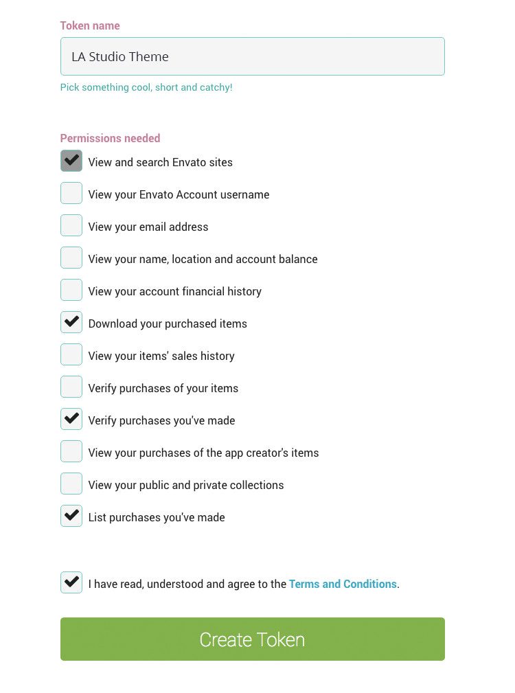
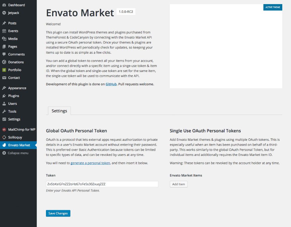
Method 1: Install the WordPress Envato Market plugin
Once installed, activated, and setup, the Envato Market plugin will display a notice in your WordPress dashboard when an update is available. To setup:
- Download the Envato Market plugin and install it through the WordPress Dashboard at: Plugins > Add New
- Activate the plugin.
- Navigate to the Envato Market menu, follow the instructions to generate a Global OAuth Personal Token, and enter the Token in your WordPress Dashboard:
Method 2: Manually Install the Update
To manually install a new version of the theme:
- Backup the current version of the theme.
- Delete the old version and reinstall the latest version. You will not be able to install the new version while the old version is still installed.
NOTICE: If direct customizations have been made to the
parent theme, they will be overwritten when the theme is updated. The
recommended way to apply theme file customizations is to use a
child theme.
Demo Importer
With Admire, you can build a functioning website just by clicking a button and install our demo site. Admire installation will be set up with what we have on our demo website, and you can use it as a template to develop your own website.
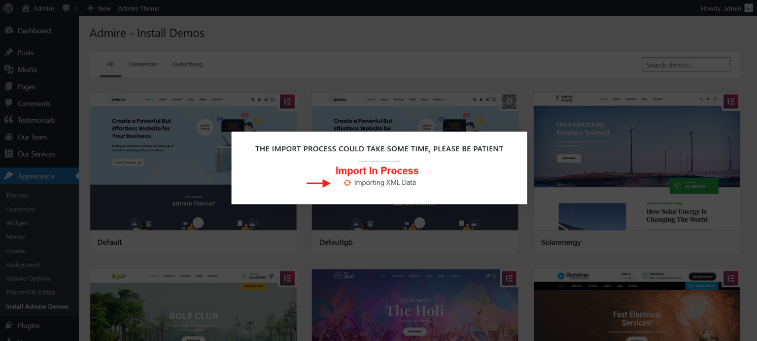
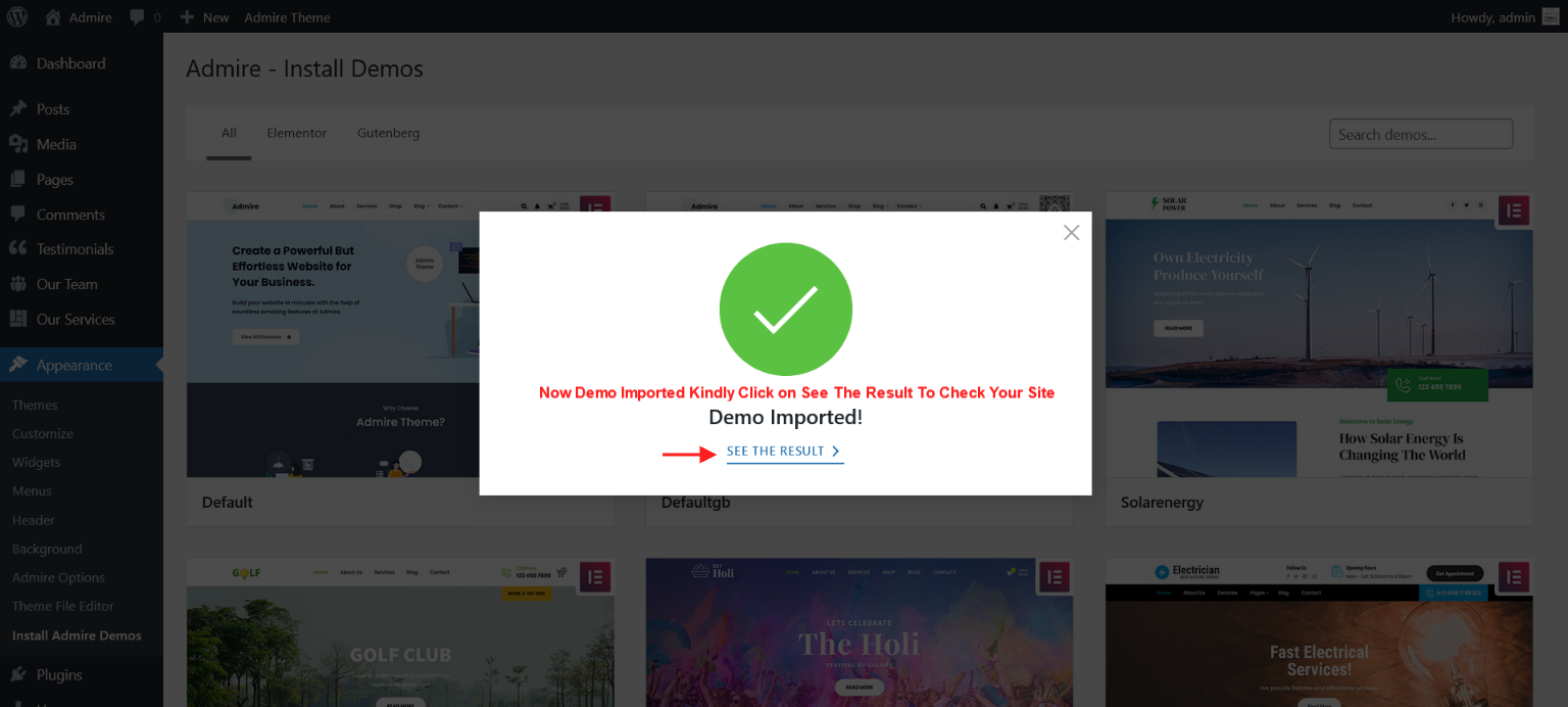
Go to Appearance > Install Admire Demos
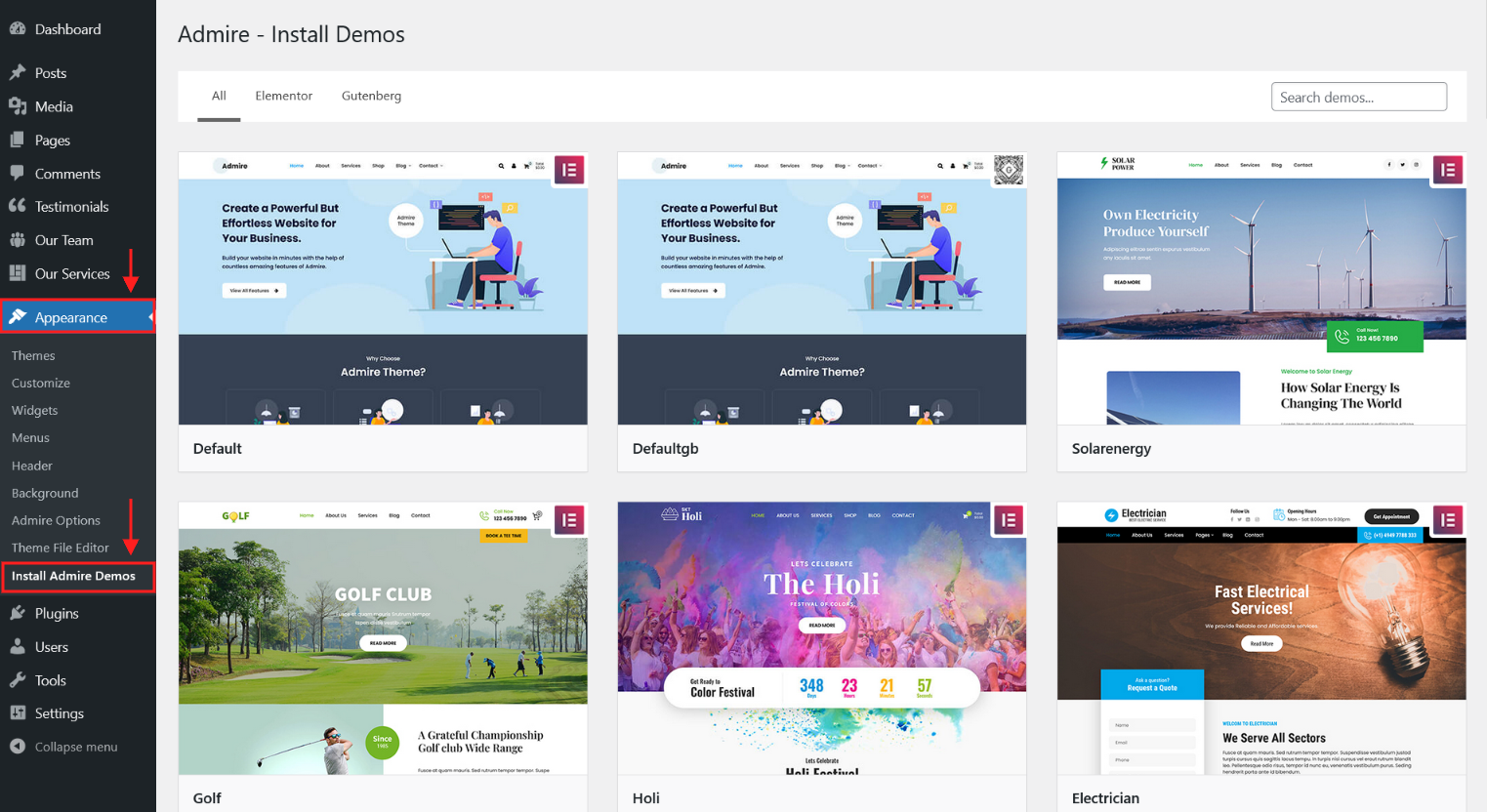
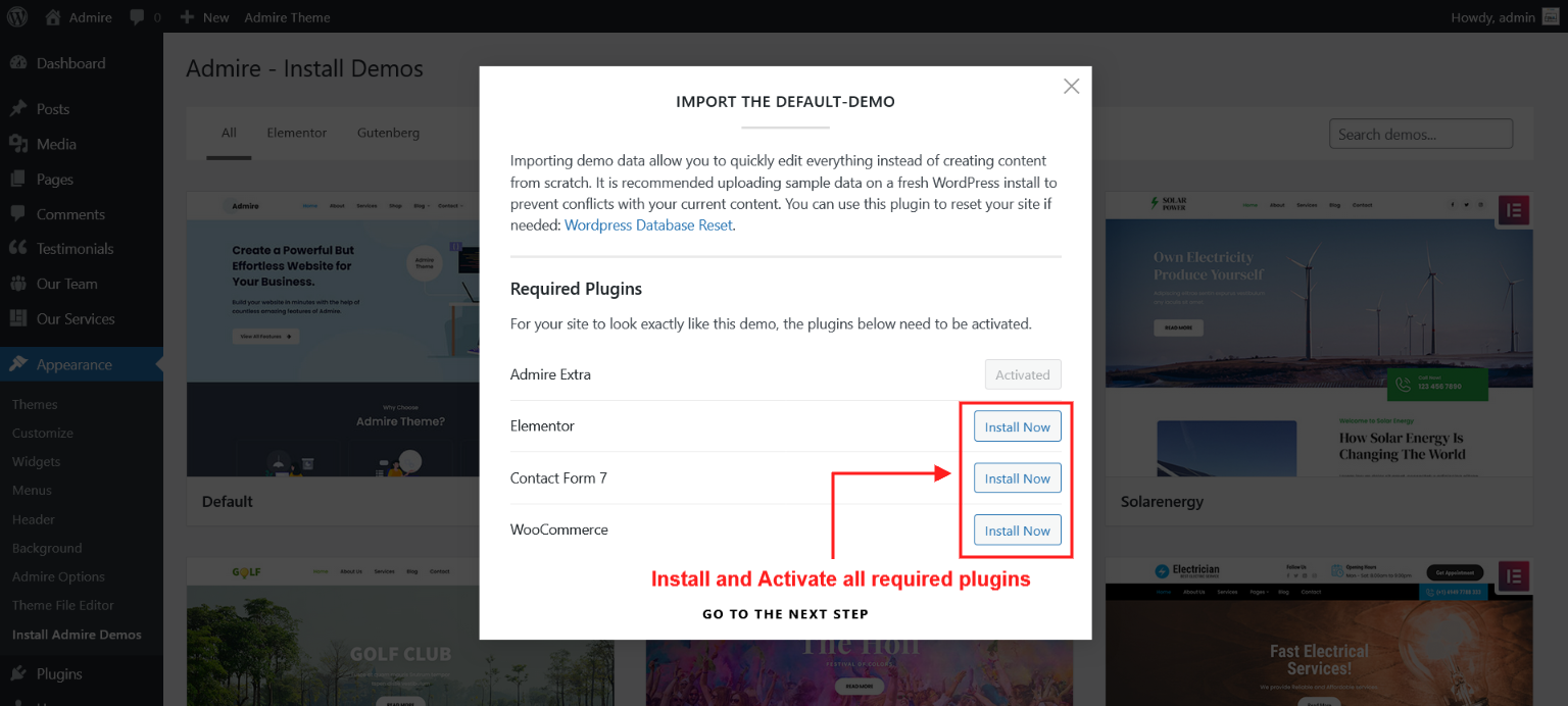
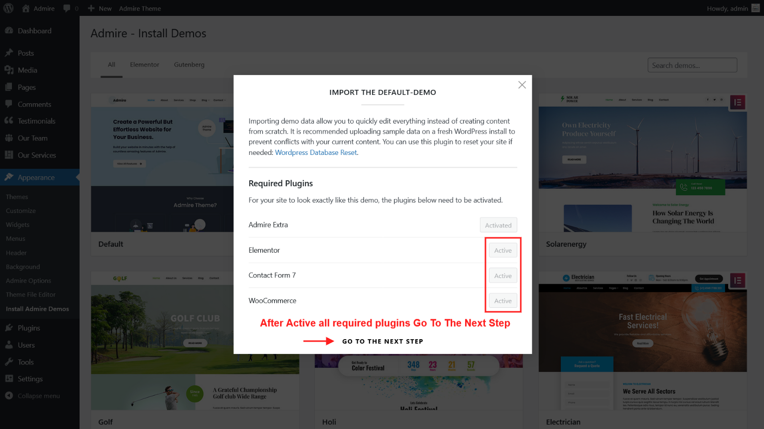
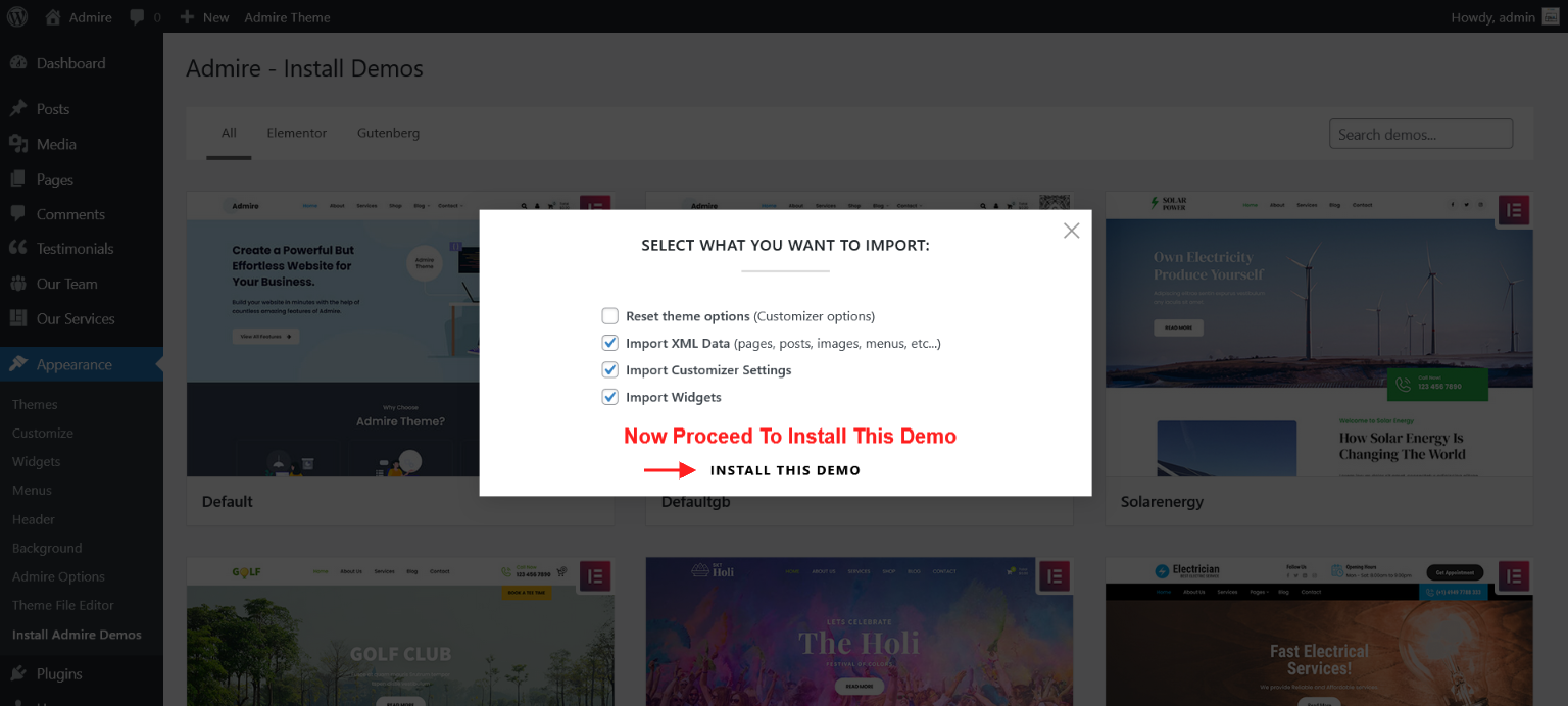
Then select the demo which you want to import and click on button "Demo Import"
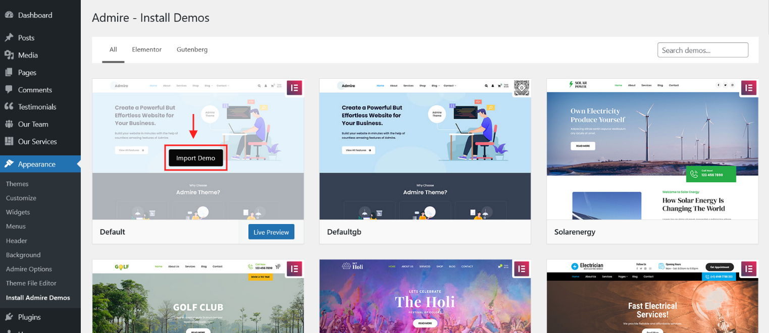
Kindly check below steps for Import Demo.
Check Demo Import Video:
General Options
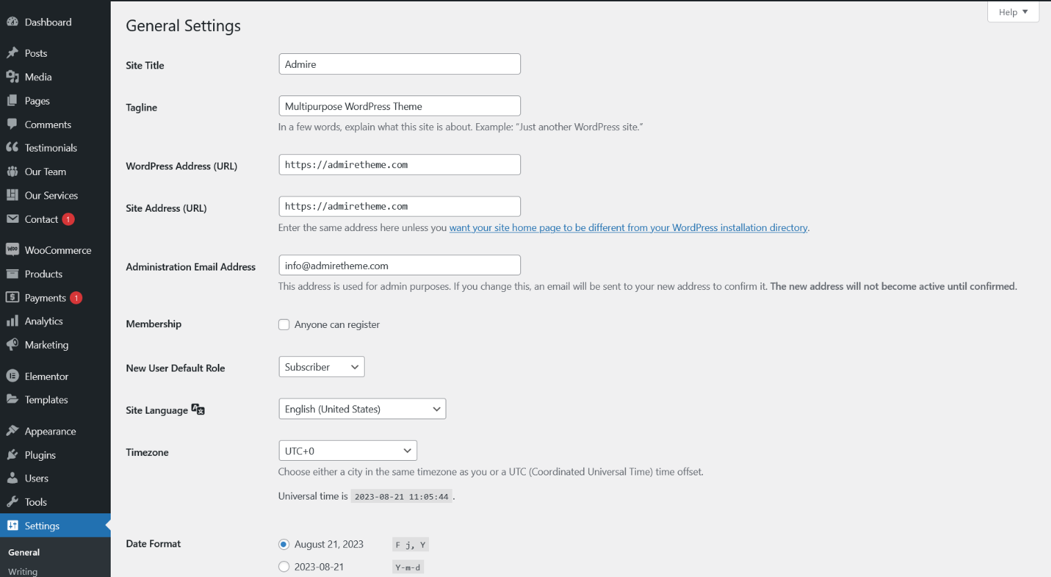
You can adjust WordPress settings as follow:
Step 1 – You can set Site Title, Tagline in Settings > General
Step 2 – You can set Blog pages show at most in Settings > Reading
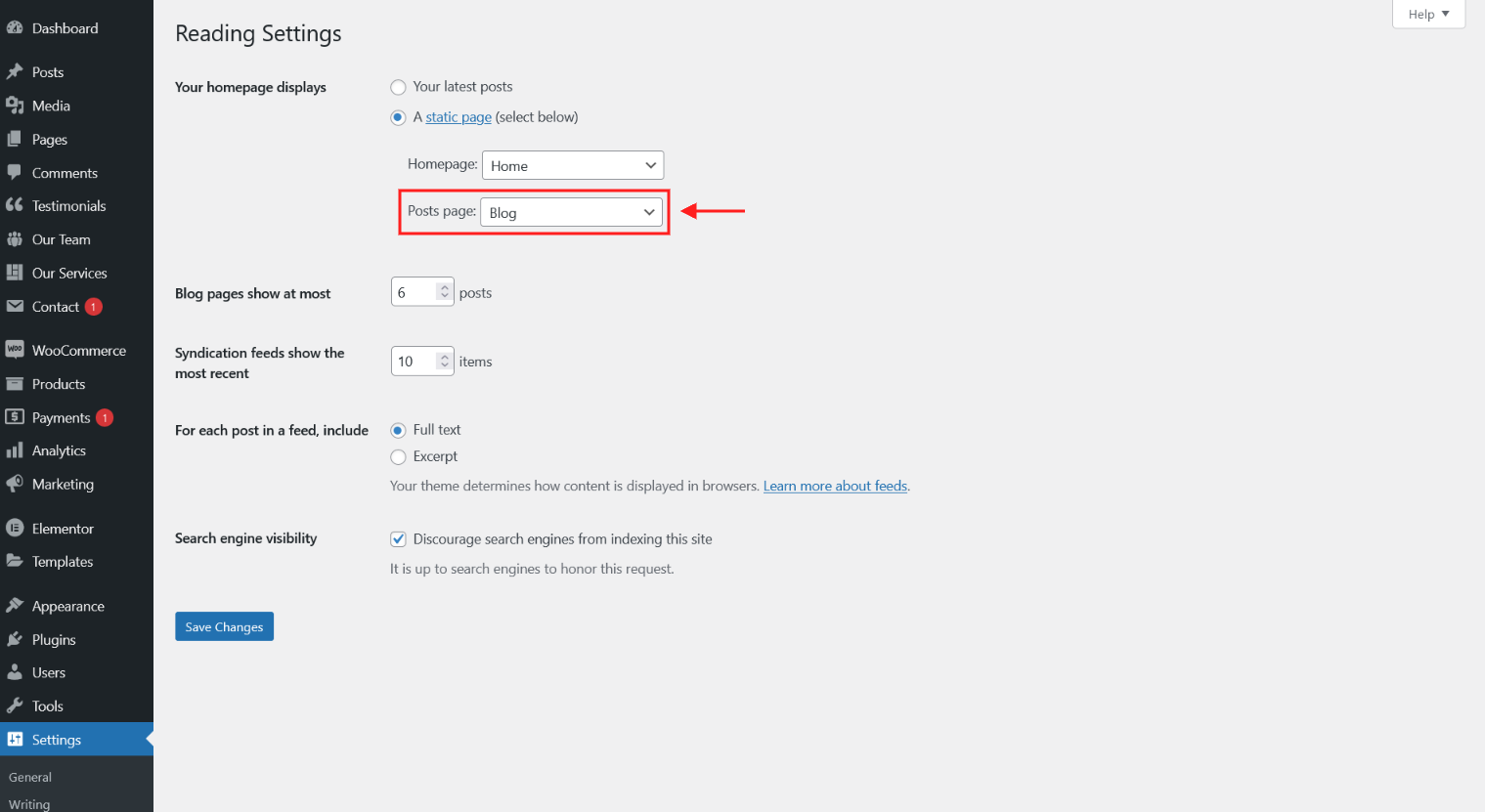
Step 3 – You can select Front Page displays in Settings > Reading

Step 4 – You can set Discussion settings in Settings > Discussion

Step 5 – You can change Image sizes in Settings > Media
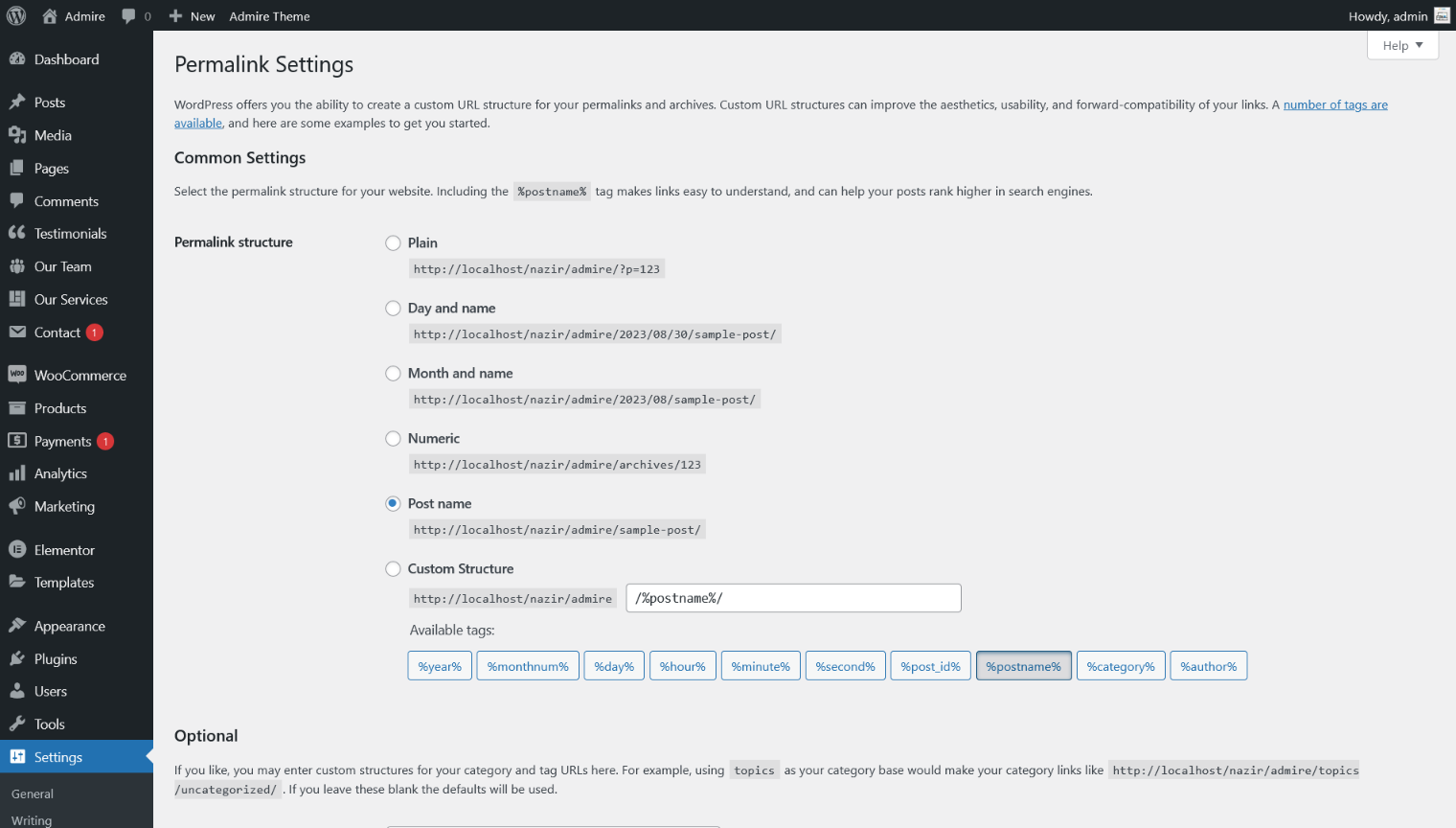
Step 6 – You should ensure that a non-default permalink setting is selected, e.g. Month and name in Settings > Permalinks
Theme Customizer/Admire Options

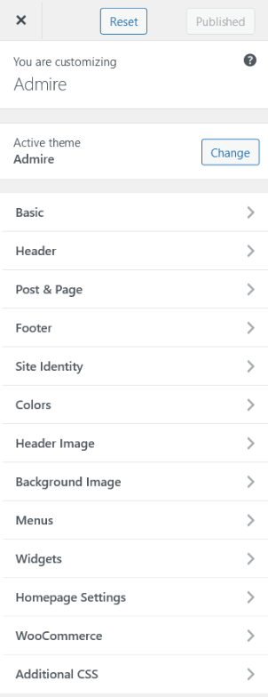
Basic
"Basic" tab has Font Typography and Shortcode Options. In this section you can control Font Typography and Shortcode Options.
1. Font Typography
2. Shortcode Options
1. Font Typography
Select Font Family and Font Size for Site Content and Site Headings.
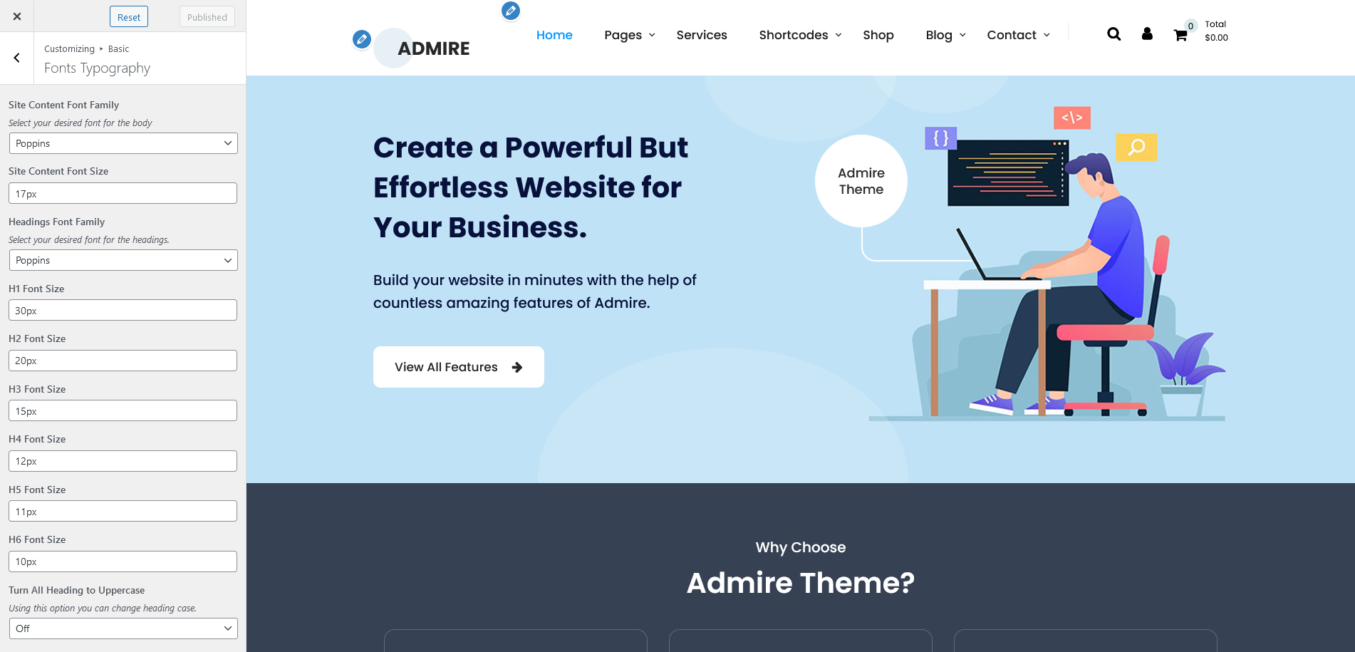
| Attribute | Description |
|---|---|
| Site Content Font Family | Select Global Font Family for Site Content. |
| Site Content Font Size | Select Global Font Size for Site Content. |
| Headings Font Family | Select global font family for the headings. |
| H1 Font Size | Select global font size for H1. |
| H2 Font Size | Select global font size for H2. |
| H3 Font Size | Select global font size for H3. |
| H4 Font Size | Select global font size for H4. |
| H5 Font Size | Select global font size for H5. |
| H6 Font Size | Select global font size for H6. |
| Turn All Headings to Uppercase | Using this option you can change headings case. |
2. Shortcode Options
Control Testimonial Shortcode Option.
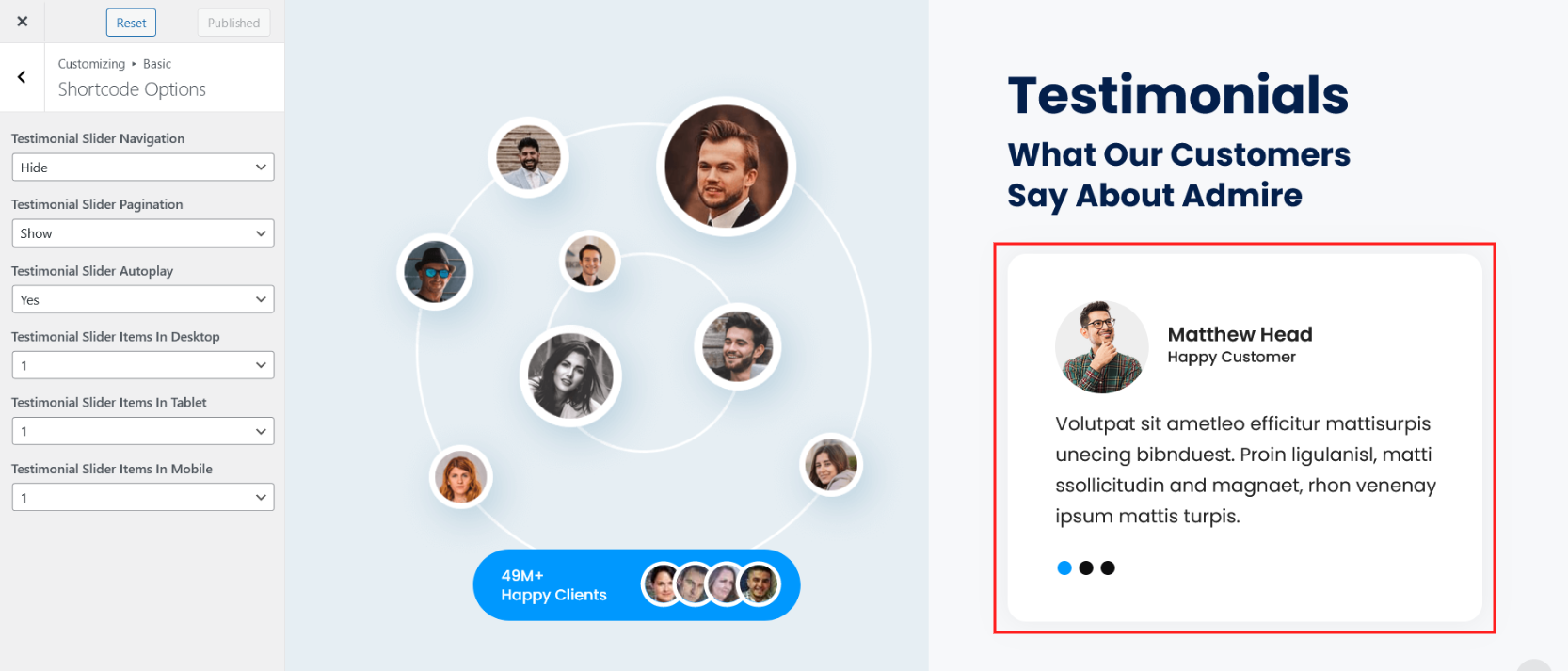
| Attribute | Description |
|---|---|
| Testimonial Slider Navigation | Select Testimonial Slider Navigation Show or Hide. |
| Testimonial Slider Pagination | Select Testimonial Slider Pagination Show or Hide. |
| Testimonial Slider Autoplay | Select Testimonial Slider Autoplay Yes or No. |
| Testimonial Slider Items In Desktop | Select Display Testimonial Slider Items Limit In Desktop In-between 1 to 5 |
| Testimonial Slider Items In Tablet | Select Display Testimonial Slider Items Limit In Tablet In-between 1 to 5 |
| Testimonial Slider Items In Mobile | Select Display Testimonial Slider Items Limit In Mobile In-between 1 to 5 |
Header
"Header" tab has Header Layouts, Top Bar, Header Color and Typography and Header Options. In this section you can control:
1. Header Layouts
2. Top Bar
3. Header Color and Typography
4. Header Options.
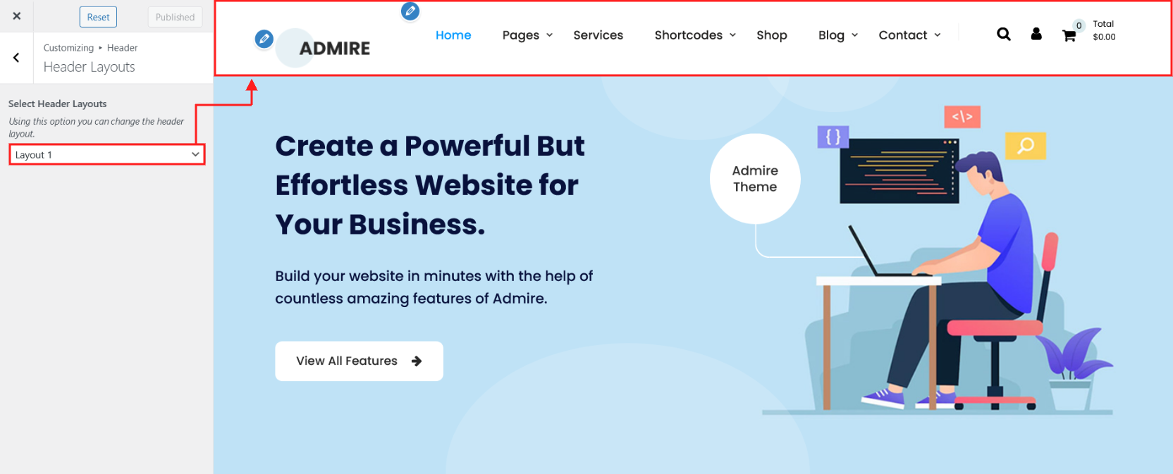
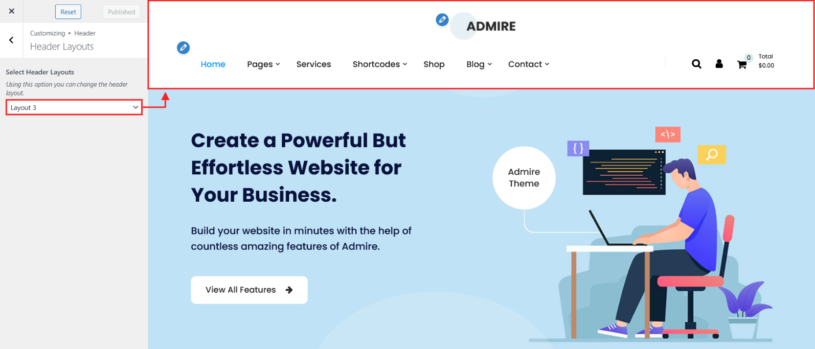
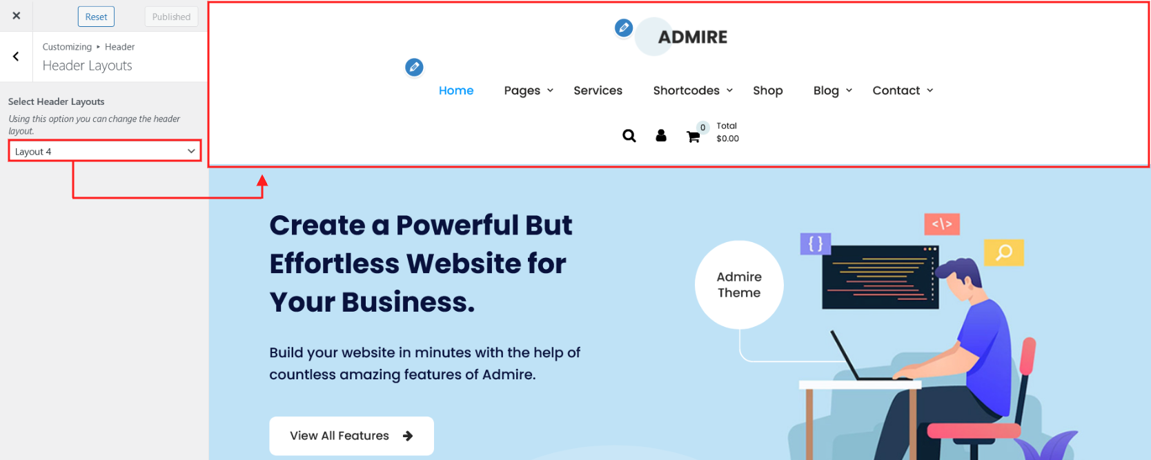
1. Header Layouts
Using this option you can control the header layout. There are 4 different layouts of header.
Layout 1
Layout 2

Layout 3
Layout 4
2. Top Bar
Using this option you can control the top bar section of the site.
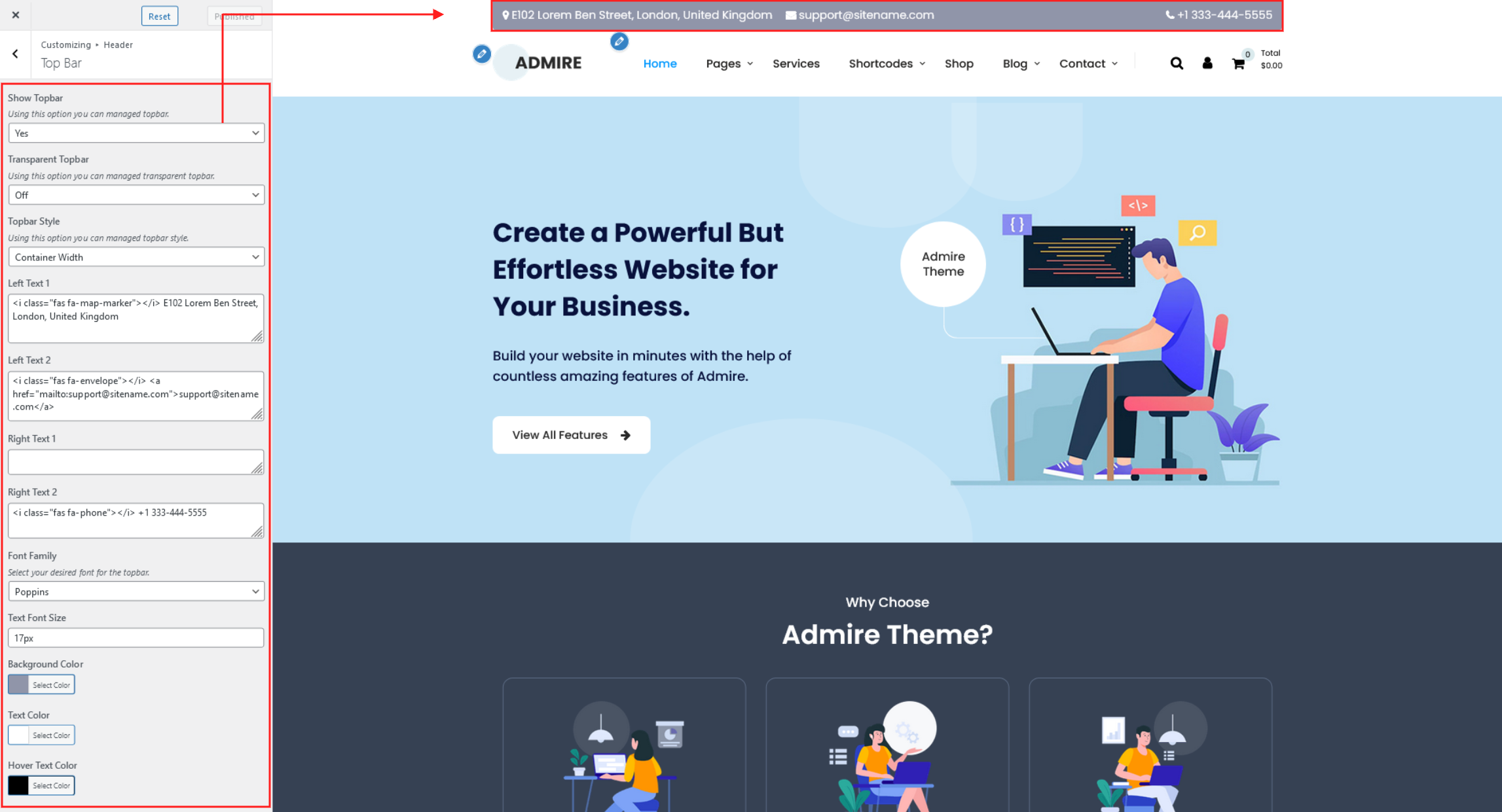
| Attribute | Description |
|---|---|
| Show Topbar | If value is "Yes" the topbar is enable. Here you select Yes or No. |
| Transparent Topbar | If value is "On" the transparent topbar is enable. Here you choose On or Off. |
| Topbar Style | There are two styles Container Width and Full Width. |
| Left Text 1 | From this option field you can manage top bar left side text. |
| Left Text 2 | From this option field you can manage top bar left side second text. |
| Right Text 1 | From this option field you can manage top bar right side text. |
| Right Text 2 | From this option field you can manage top bar right side second text. |
| Font Family | From this option field you can manage Font Family for top bar text. |
| Text Font Size | From this option field you can manage top bar text Font Size. |
| Background Color | From this option field you can manage top bar background color. |
| Text Color | From this option field you can manage top bar text color. |
| Hover Text Color | From this option field you can manage top bar text hover color. |
3. Header Color and Typography
Using this option you can control the Menu Typography and Transparent Header Option.
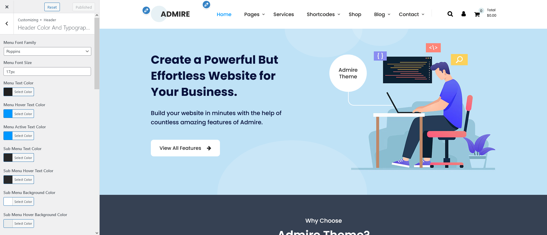
| Attribute | Description |
|---|---|
| Menu Font Family | From this option field you can manage Font Family of Header Menu. |
| Menu Font Size | From this option field you can manage Font Size of Header Menu |
| Menu Text Color Menu Hover Text Color Menu Active Text Color Sub Menu Text Color Sub Menu Hover Text Color Sub Menu Background Color Sub Menu Hover Background Color |
From this all options you can manage the header menu and sub-menu color. |
| Mobile Menu Text Color Mobile Menu Active Text Color Mobile Outer Toggle Bar Color Mobile Inner Toggle Bar Color |
From this all options you can manage the mobile header menu color. |
| Header Background Color | From this option field you can manage header background color. |
| Icon Color Icon Hover Color |
From this option field you can change the header icon color and hover color.[Search Icon, My Account Icon, Cart Icon] |
| Cart Count Color | From this option field you can change the cart count number color. |
| Cart Count Background Color | From this option field you can change the cart count background color. |
| Search Box Background Color Search Box Text Color |
From this option field you can change the search box background color and text color. search box appearing when click on search icon. |
| Turn Menu Text to Uppercase | If value is "On" the Header menu text case change in Uppercase. Here you choose On or off. |
| Transparent Header On Frontpage | From this option field you can set the Transparent Header On Frontpage If value is "On" Here you choose On or off. |
| Frontpage Header Background Color Opacity | From this option field you can set the opacity of header background color. Here you can set value from range 0.1 to 1.(This option worked when Transparent Header On Frontpage is set On.) |
| Transparent Header On Inner Page/Post | From this option field you can set the Transparent Header On Inner Page/Post If value is "On" Here you choose On or off. |
| Inner Page/Post Header Background Color Opacity | From this option field you can set the opacity of Inner Page/Post header background color. Here you can set value from range 0.1 to 1.(This option worked when Transparent Header On Inner Page/Post is set On.) |
4. Header Options
Using this option you can control the Header Option.

| Attribute | Description |
|---|---|
| Display Search | If value is "Yes" the display search is enable in Header. Here you choose Yes or No. |
| Display My Account | If value is "Yes" my account is enable in Header. Here you choose Yes or No. [This option working when WooCommerce Activated] |
| Display My Cart | If value is "Yes" my cart is enable in Header. Here you choose Yes or No. [This option working when WooCommerce Activated] |
| Display Logo | If value is "Yes" logo is enable in Header. Here you choose Yes or No. |
| Display Menu | If value is "Yes" menu is enable in Header. Here you choose Yes or No. |
| Sticky Header | If value is "Yes" sticky header is enable. Here you choose Yes or No. |
Post & Page
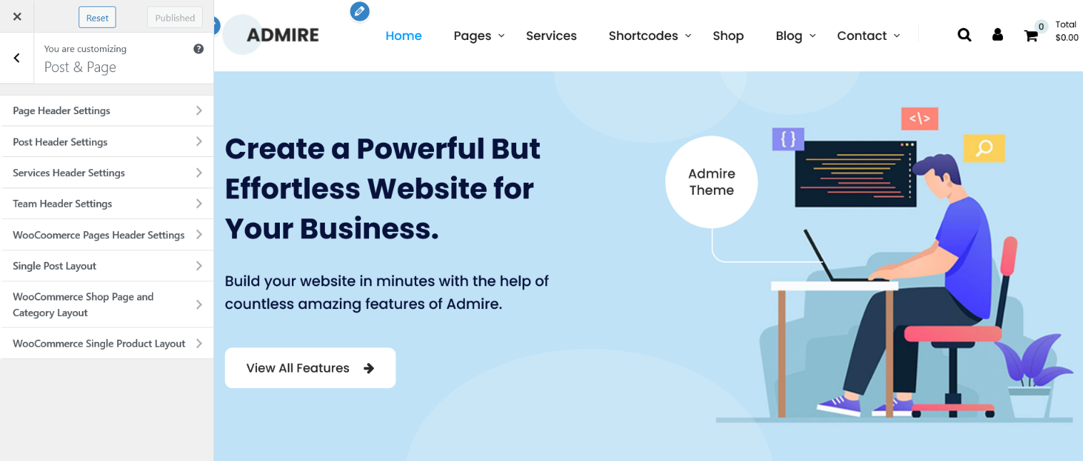
1. Page Header Settings
2. Post Header Settings
3. Services Header Settings
4. Team Header Settings
5. WooCommerce Pages Header Settings
6. Single Post Layout
7. WooCommerce Shop Page and Category Layout
8. WooCommerce Single Product Layout.
1. Page Header Settings
Using this option you can control the inner page header settings.
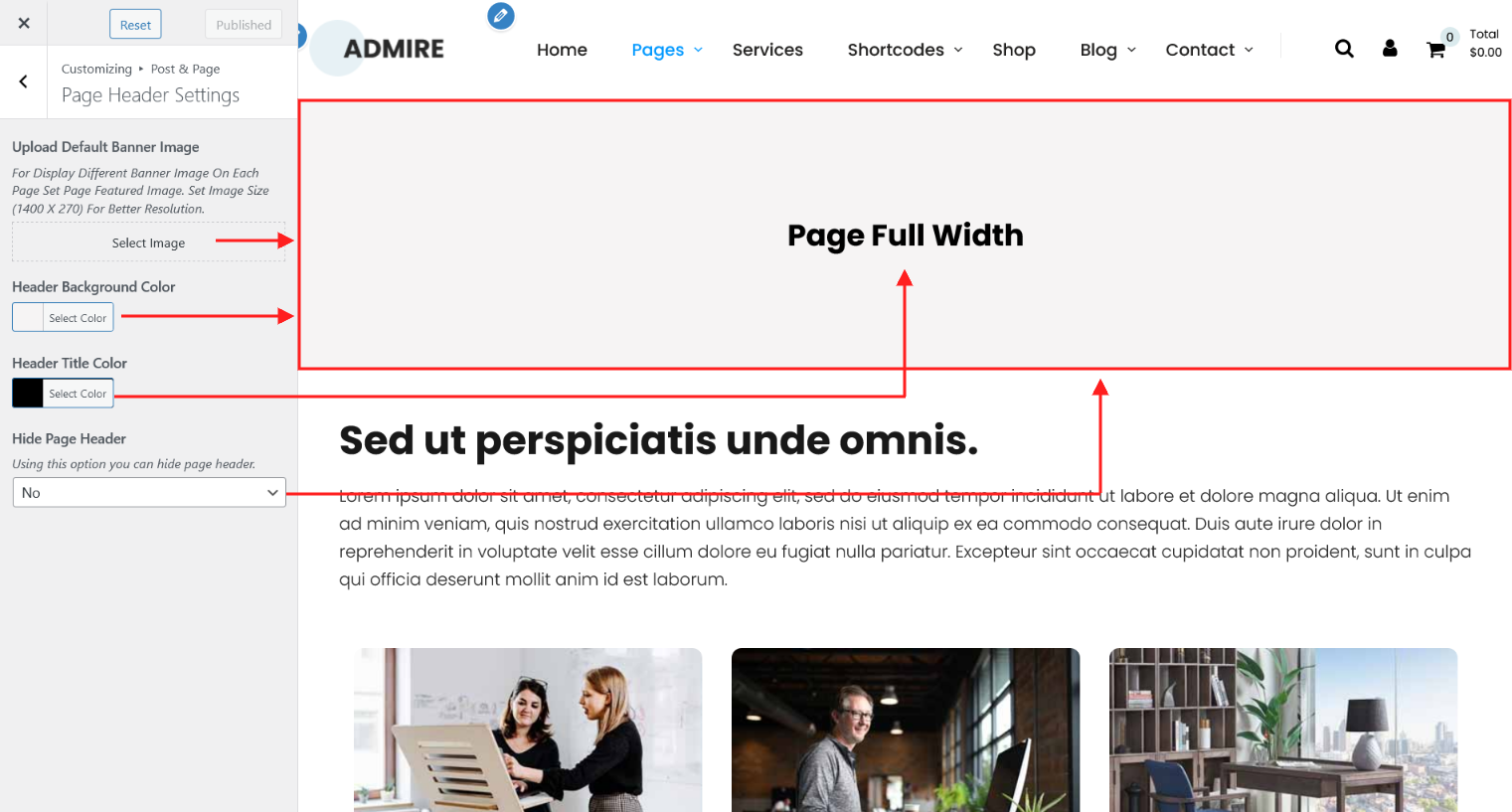
| Attribute | Description |
|---|---|
| Upload Default Banner Image | From this option field you can set default banner image for all pages. |
| Header Background Color | From this option field you can set header banner background color for all pages.[This option work when default banner image not set]. |
| Header Title Color | From this option field you can set the header banner title color. |
| Hide Page Header | If value is set "Yes" than header banner display hide. Here you choose Yes or No. |
2. Post Header Settings
Using this option you can control the single post header settings.
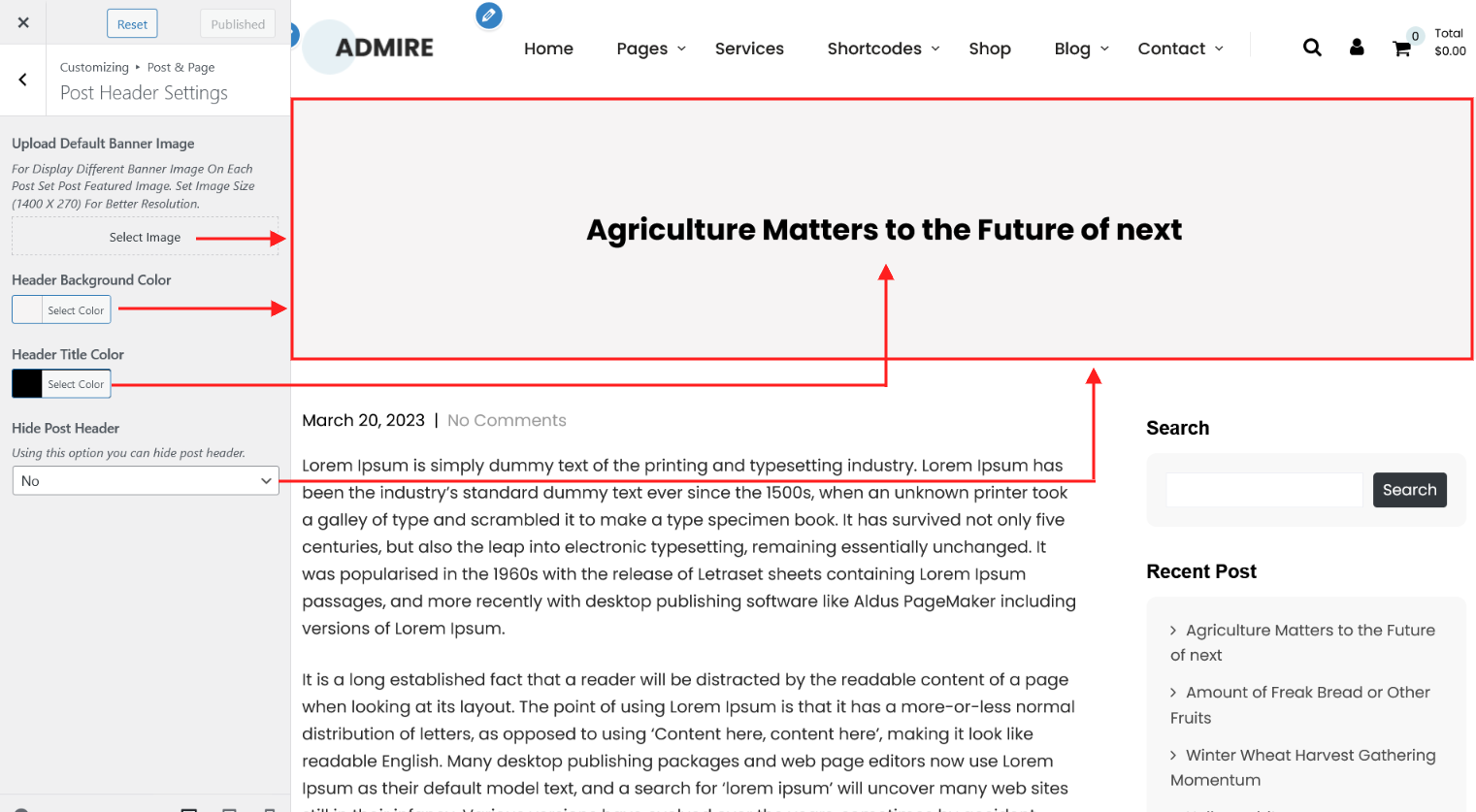
| Attribute | Description |
|---|---|
| Upload Default Banner Image | From this option field you can set default banner image for all single posts. |
| Header Background Color | From this option field you can set header banner background color for all single posts.[This option work when default banner image not set]. |
| Header Title Color | From this option field you can set the header banner title color. |
| Hide Post Header | If value is set "Yes" than header banner display hide. Here you choose Yes or No. |
3. Services Header Settings
Using this option you can control the services single header settings.
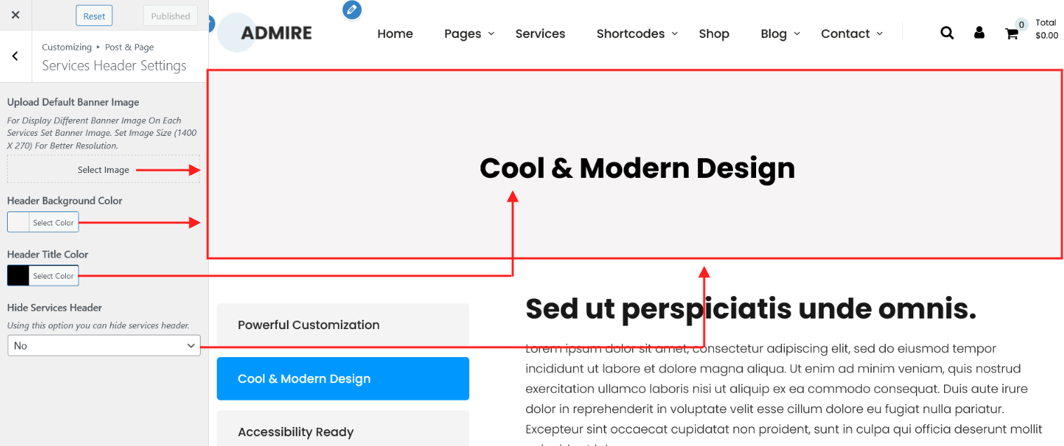
| Attribute | Description |
|---|---|
| Upload Default Banner Image | From this option field you can set default banner image for all services single posts. |
| Header Background Color | From this option field you can set header banner background color for all services single posts.[This option work when default banner image not set]. |
| Header Title Color | From this option field you can set the header banner title color. |
| Hide Services Header | If value is set "Yes" than header banner display hide. Here you choose Yes or No. |
4. Team Header Settings
Using this option you can control the team single page header settings.

| Attribute | Description |
|---|---|
| Upload Default Banner Image | From this option field you can set default banner image for all team single page. |
| Header Background Color | From this option field you can set header banner background color for all team single page.[This option work when default banner image not set]. |
| Header Title Color | From this option field you can set the header banner title color. |
| Hide Team Header | If value is set "Yes" than header banner display hide. Here you choose Yes or No. |
5. WooCommerce Pages Header Settings
Using this option you can control the all woocommerce pages and woocommerce product details header settings.
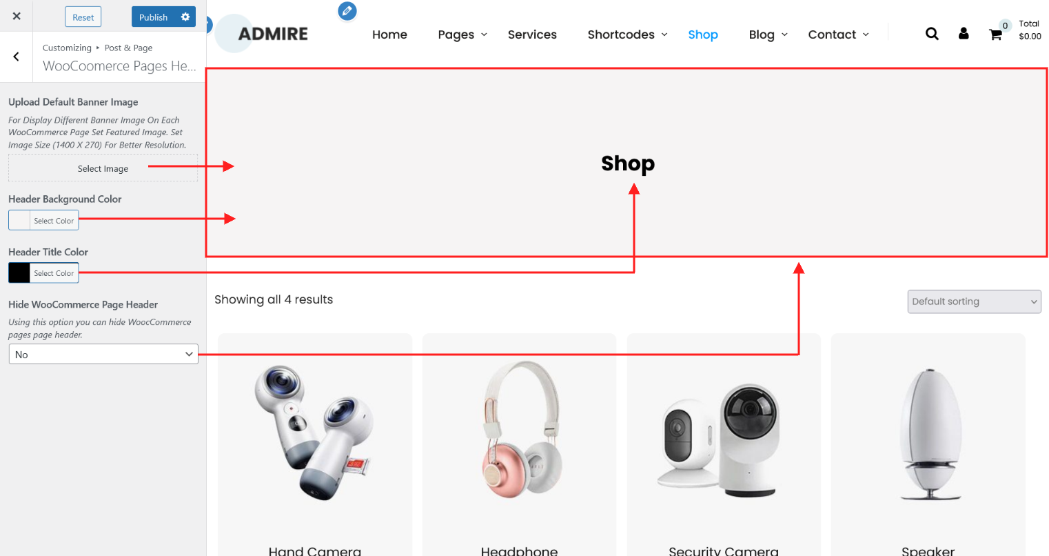
| Attribute | Description |
|---|---|
| Upload Default Banner Image | From this option field you can set default banner image for all woocommerce pages and woocommerce product details. |
| Header Background Color | From this option field you can set header banner background color for all woocommerce pages and woocommerce product details.[This option work when default banner image not set]. |
| Header Title Color | From this option field you can set the header banner title color. |
| Hide WooCommerce Page Header | If value is set "Yes" than header banner display hide. Here you choose Yes or No. |
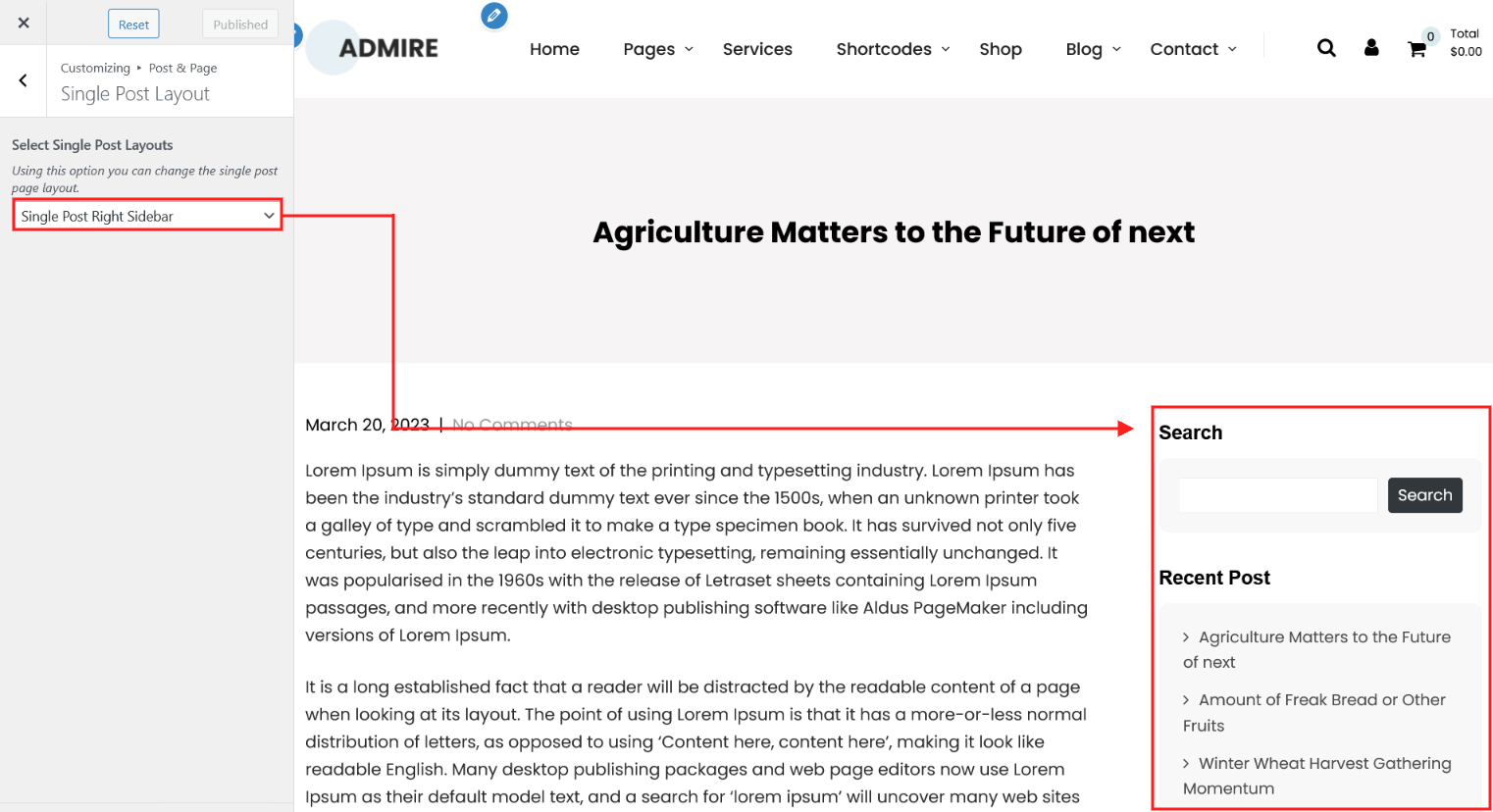
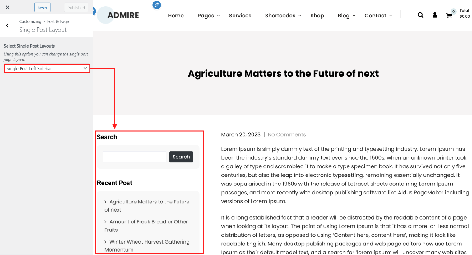
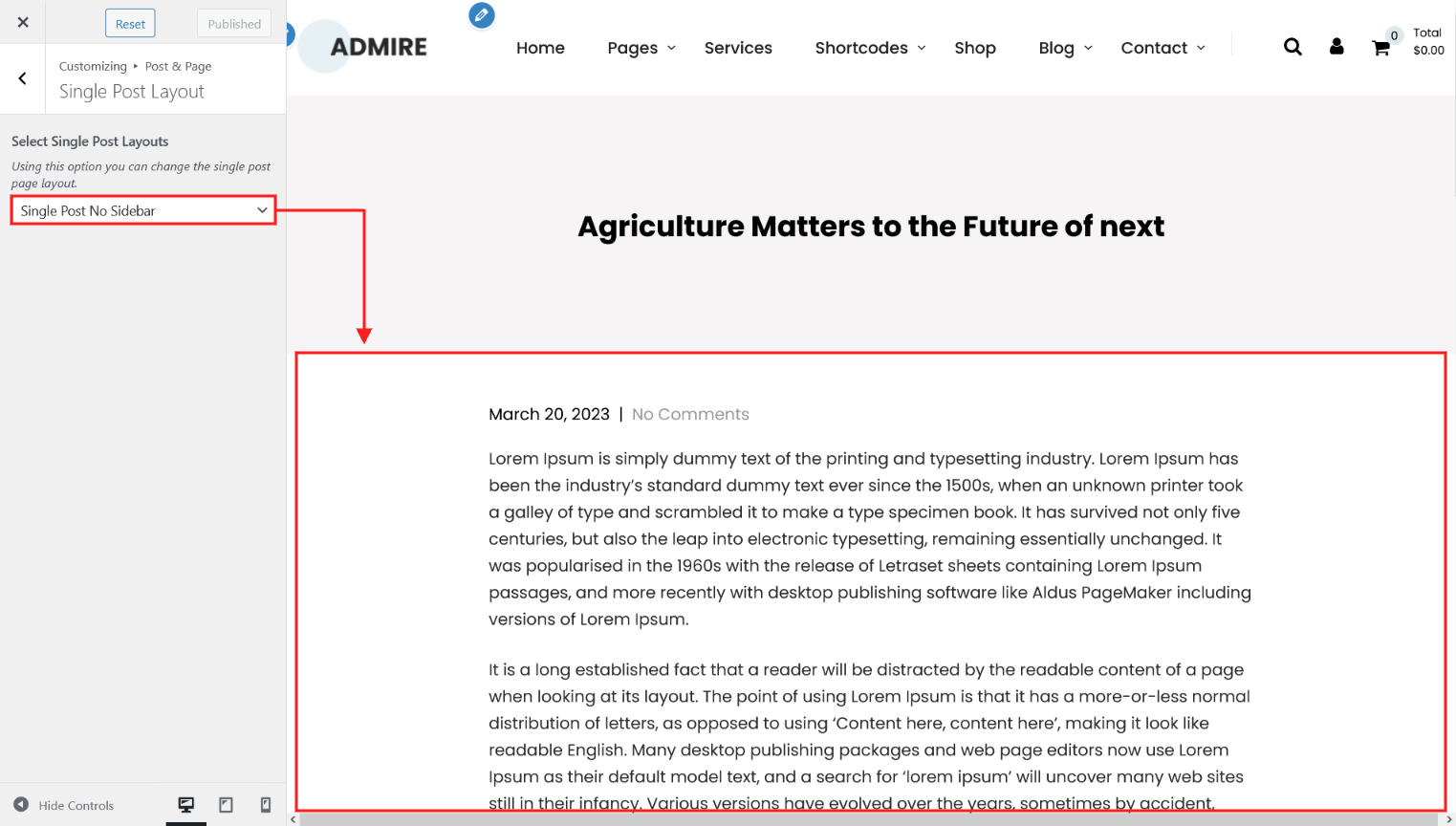
6. Single Post Layout
Using this option you can control the single post layout. There are 4 different layouts of single post.
Single Post Right Sidebar
Single Post Left Sidebar
Single Post Full Width

Single Post No Sidebar
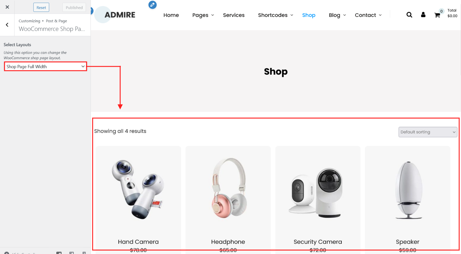
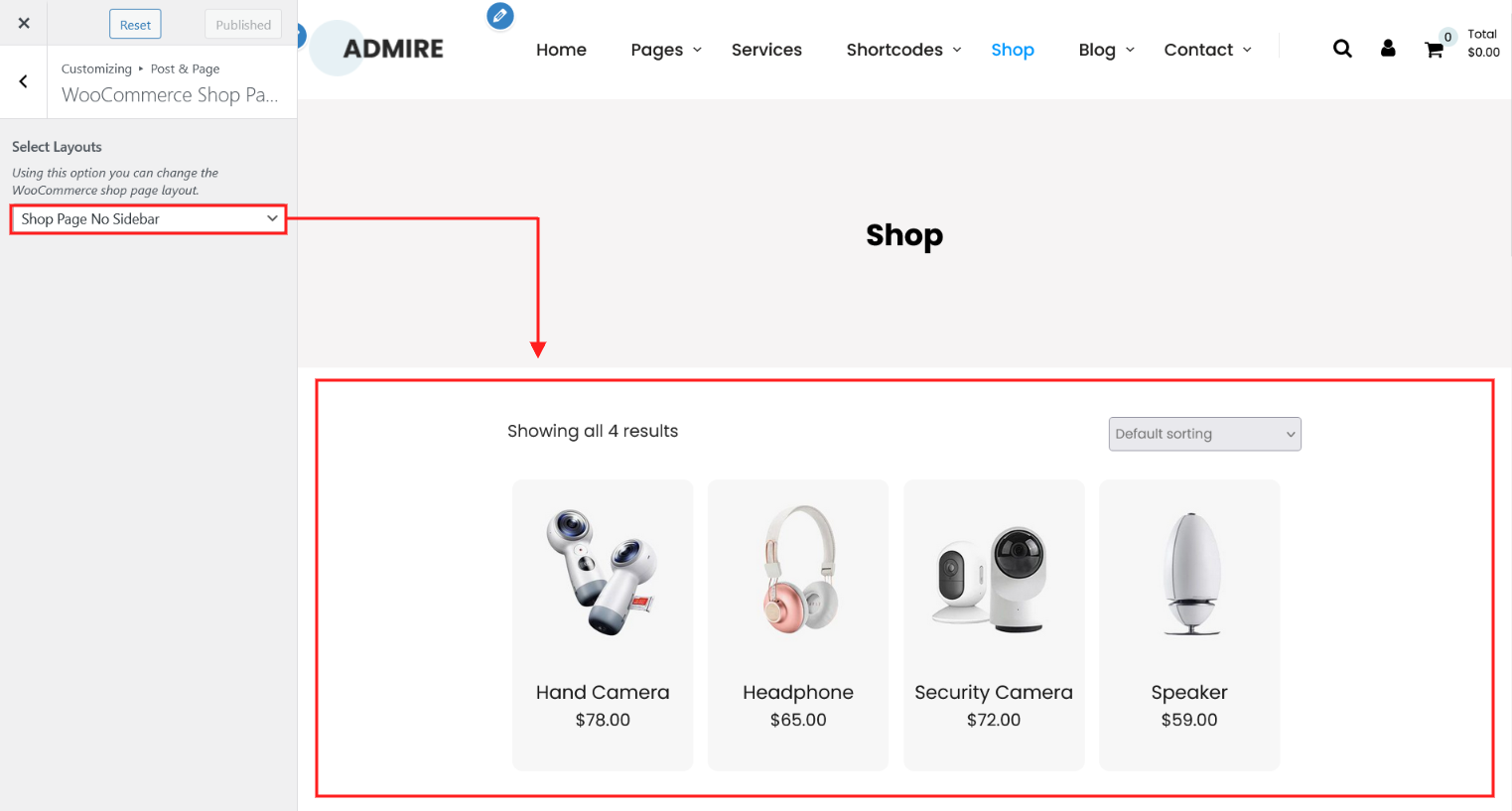
7. WooCommerce Shop Page and Category Layout
Using this option you can control the WooCommerce Shop Page and Category Layout. There are 4 different layouts of WooCommerce Shop Page and Category Layout.
Shop Page Full Width
Shop Page Right Sidebar

Shop Page Left Sidebar

Shop Page No Sidebar
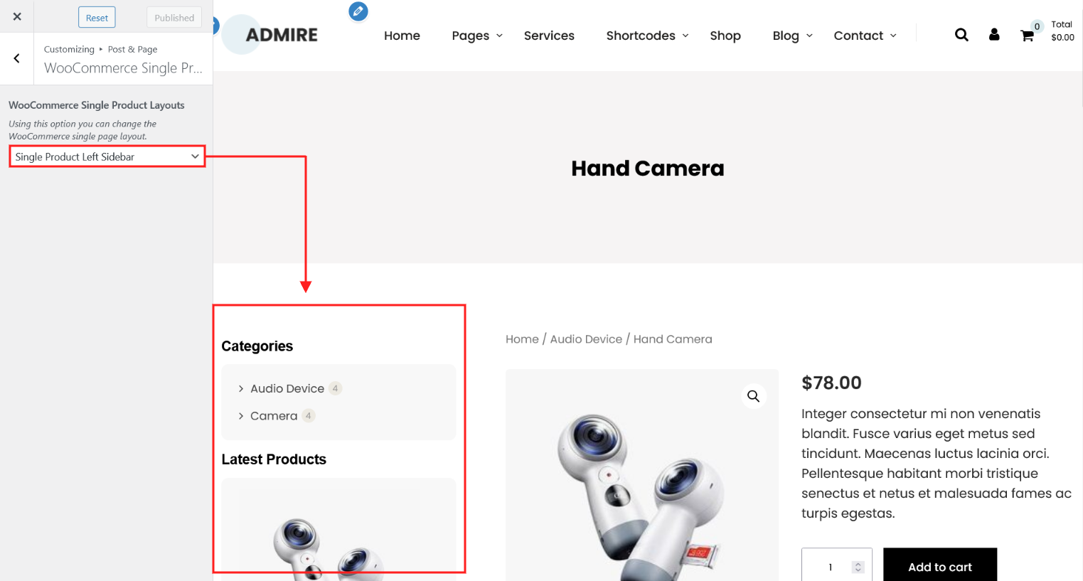
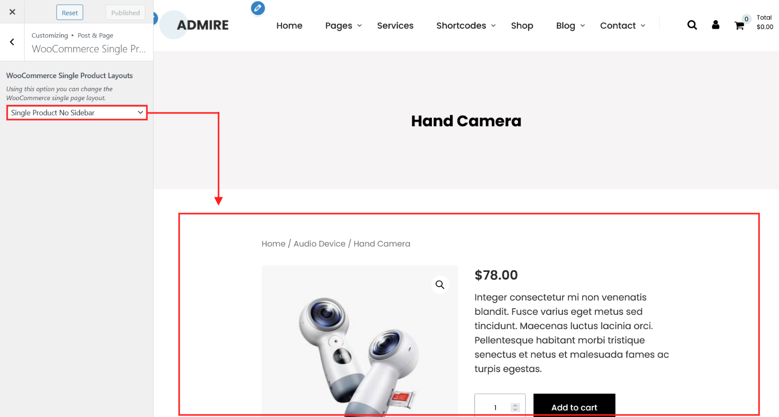
8. WooCommerce Single Product Layout
Using this option you can control the woocommerce single product page layout. There are 4 different layouts of woocommerce single product page.
Single Product Full Width

Single Product Right Sidebar

Single Product Left Sidebar
Single Product No Sidebar
Footer
"Footer" tab has Footer Layouts, Footer Columns, Footer Color and Footer Copyright Text. In this section you can control:
1. Footer Layouts
2. Footer Columns
3. Footer Color
4. Footer Copyright Text.
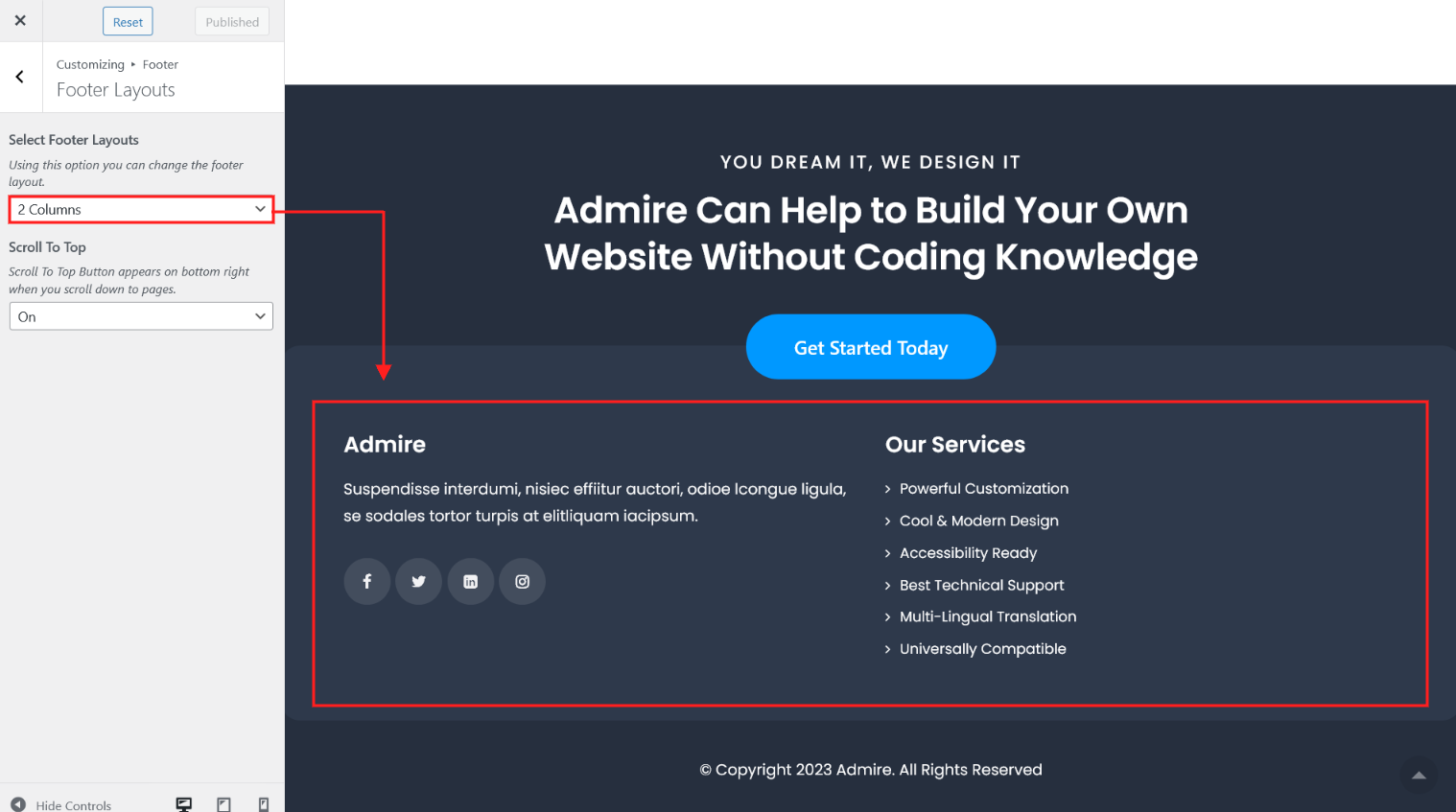
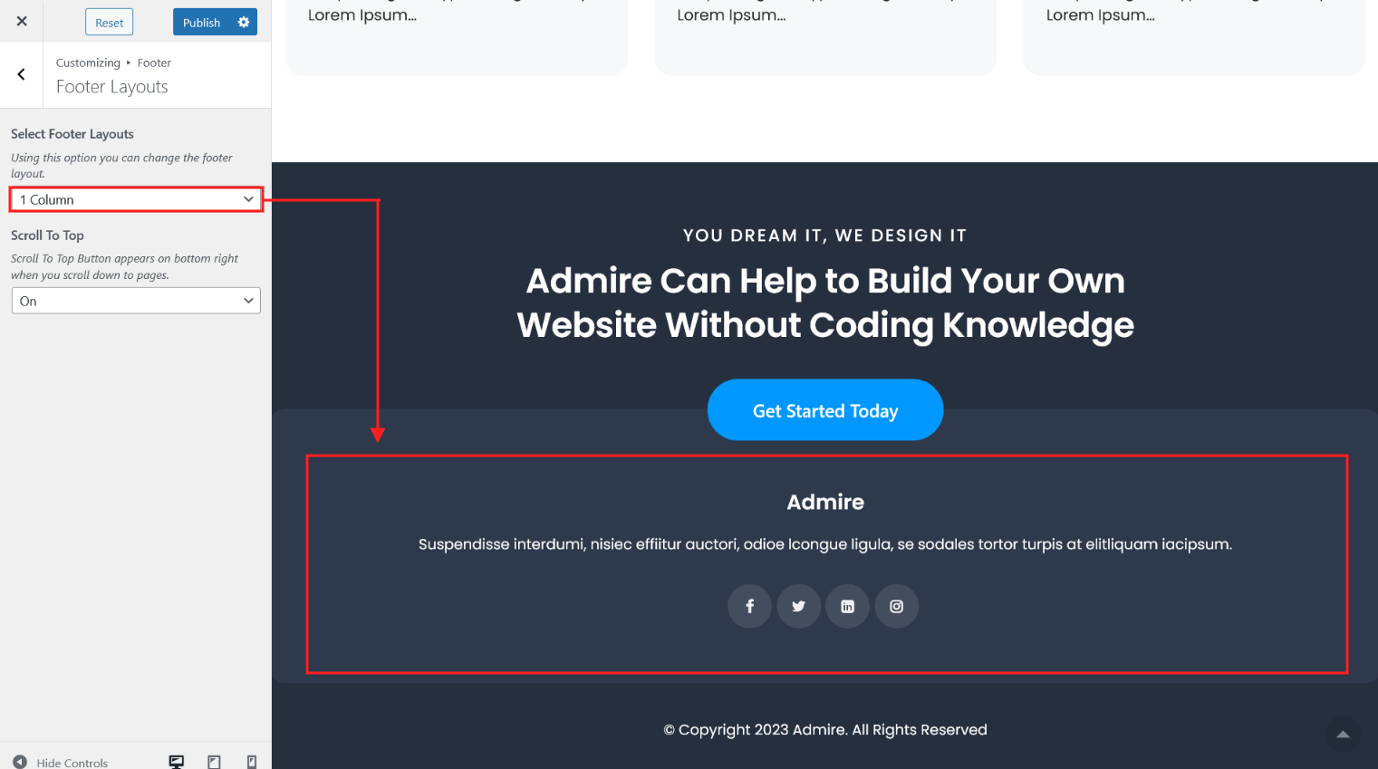
1. Footer Layouts
Using this option you can control the footer layout. There are 4 different layouts of footer.
4 Columns

3 Columns

2 Columns
1 Columns
Scroll To Top
Using this option you can control go to top scroll. Here you choose On or Off.

2. Footer Columns

| Attribute | Description |
|---|---|
| Display Footer | Using this option you can Show/Hide footer. Here you choose Yes or No. |
| Column 1 Title Column 1 Content |
Using this option you can manage footer column 1 title and content. |
| Column 2 Title Column 2 Content |
Using this option you can manage footer column 2 title and content. |
| Column 3 Title Column 3 Content |
Using this option you can manage footer column 3 title and content. |
| Column 4 Title Column 4 Content |
Using this option you can manage footer column 4 title and content. |
3. Footer Color

| Attribute | Description |
|---|---|
| Footer Heading Font Size | From this option field you can manage font size of footer heading. |
| Footer Background Image | From this option field you can set background image of footer.. |
| Footer Background Color | From this option field you can set background color of footer. this option work if footer background image is not set. |
| Footer Box Background Color | From this option field you can set background color of footer box. |
| Footer Box Background Color Opacity | From this option field you can set opacity of footer box background color. Here you can set value from range 0.1 to 1 |
| Footer Box Link Color | From this option field you can set color of footer box link. |
| Footer Box Link Hover Color | From this option field you can set hover color of footer box link. |
| Footer Title Color | From this option field you can set color of footer heading title. |
| Footer Content Color | From this option field you can set color of footer content. |
| Copyright Text Color | From this option field you can set color of footer copyright text. |
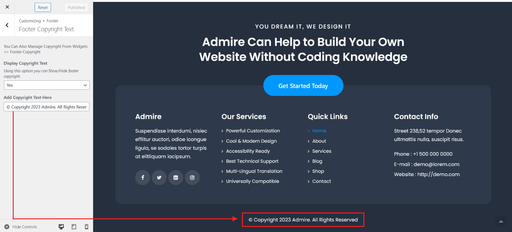
4. Footer Copyright Text
| Attribute | Description |
|---|---|
| Display Copyright Text | Using this option you can Show/Hide footer copyright text. Here you choose Yes or No. |
| Add Copyright Text Here | Using this option you can add your copy right text here. |
Site Identity
In this section you can do all things about logo on your site(set logo image, set logo title, logo title color, logo top spacing)
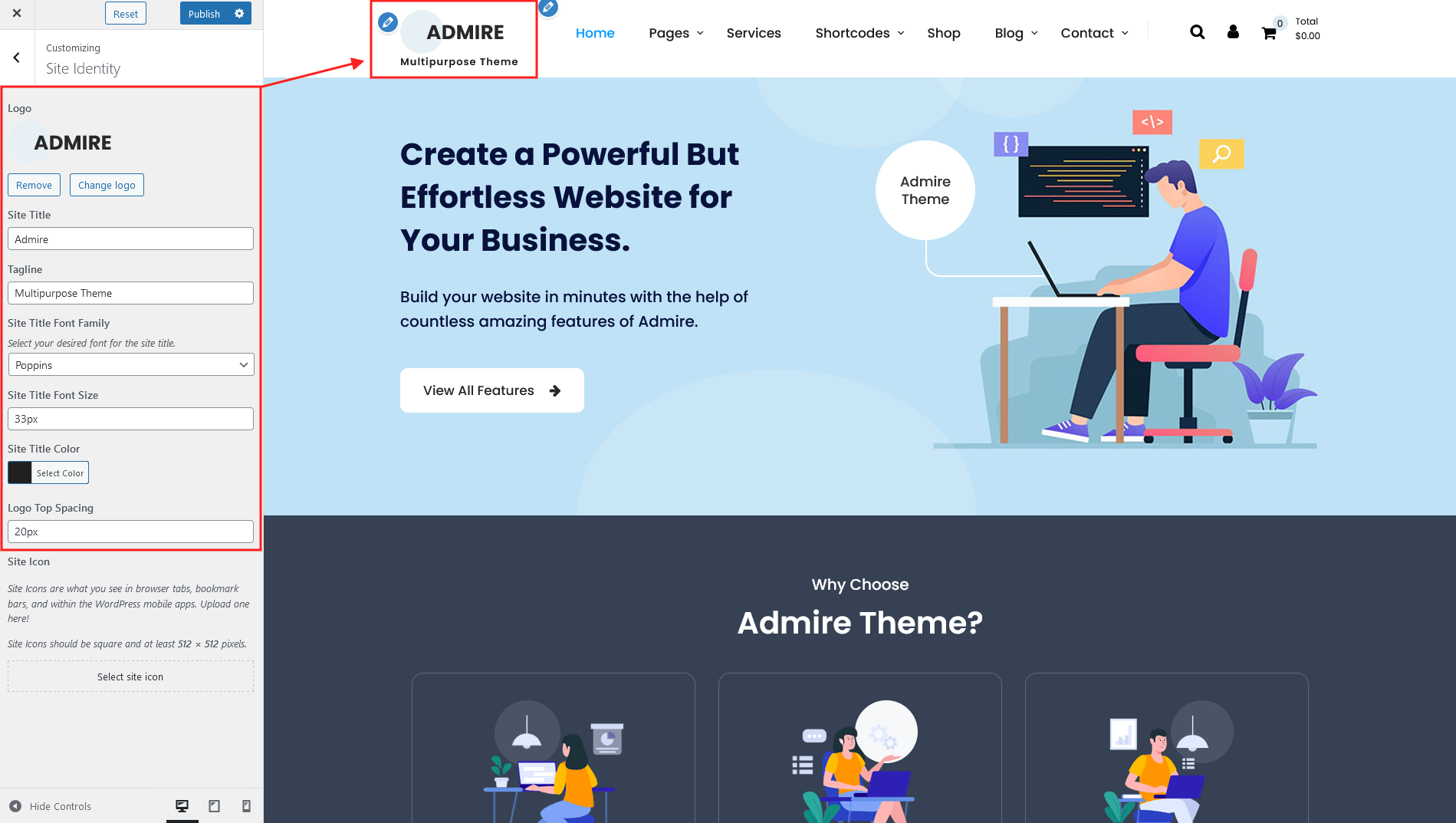
| Attribute | Description |
|---|---|
| Logo | Using this option you can set image logo for your website. |
| Site Title | Using this option you can set text logo for your website. Site title work if image logo not set. |
| Tagline | Using this option you can set tagline. |
| Site Title Font Family | Using this option you can set font family for site title (text logo). |
| Site Title Font Size | Using this option you can set font size for site title (text logo). |
| Site Title Color | Using this option you can set color for site title (text logo). |
| Logo Top Spacing | Using this option you can set top spacing of logo image and logo text |
| Site Icon | Using this option you can set favicon for you site. |
Colors
Using this option field you can manage colors of headings and shortcodes options.

| Attribute | Description |
|---|---|
| Background Color | Using this option field you can set the body background color of your site. |
| Color Scheme | Using this option field you can set the color scheme of your site. |
| Anchor Color | Using this option field you can set the default anchor color. |
| Anchor Hover Color | Using this option field you can set the default anchor hover color. |
| H1 Color | Using this option field you can set the default color for H1 heading. |
| H2 Color | Using this option field you can set the default color for H2 heading. |
| H3 Color | Using this option field you can set the default color for H3 heading. |
| H4 Color | Using this option field you can set the default color for H4 heading. |
| H5 Color | Using this option field you can set the default color for H5 heading. |
| H6 Color | Using this option field you can set the default color for H6 heading. |
| Social Icon Color | Using this option field you can set the color of social icon shortcode. |
| Social Icon Background Color |
Using this option field you can set the background color of social icon shortcode. |
| Social Icon Hover Color | Using this option field you can set the hover color of social icon shortcode. |
| Social Icon Background Hover Color |
Using this option field you can set the background hover color of social icon shortcode. |
| Post Style 1 Background Color |
Using this option field you can set the background color of post style 1 shortcode. |
| Post Style 1 Meta Color | Using this option field you can set the meta color of post style 1 shortcode. |
| Post Style 1 Meta Background Color |
Using this option field you can set the meta background color of post style 1 shortcode. |
| Post Style 1 Title Color | Using this option field you can set the title color of post style 1 shortcode. |
| Post Style 1 Title Hover Color |
Using this option field you can set the title hover color of post style 1 shortcode. |
| Post Style 1 Description Color |
Using this option field you can set the description color of post style 1 shortcode. |
| Post Style 2 Title Color | Using this option field you can set the title color of post style 2 shortcode. |
| Post Style 2 Title Hover Color |
Using this option field you can set the title hover color of post style 2 shortcode. |
| Post Style 2 Meta Color | Using this option field you can set the meta color of post style 2 shortcode. |
| Post Style 2 Meta Hover Color |
Using this option field you can set the meta hover color of post style 2 shortcode. |
| Post Style 2 Description Color | Using this option field you can set the description color of post style 2 shortcode. |
| Post Style 3 Border Color | Using this option field you can set the boder color of post style 3 shortcode. |
| Post Style 3 Box Background Color |
Using this option field you can set the box background color of post style 3 shortcode. |
| Post Style 3 Box Background Hover Color |
Using this option field you can set the box background hover color of post style 3 shortcode. |
| Post Style 3 Title Color | Using this option field you can set the title color of post style 3 shortcode. |
| Post Style 3 Description Color | Using this option field you can set the description color of post style 3 shortcode. |
| Post Style 3 Button Color | Using this option field you can set the button color of post style 3 shortcode. |
| Post Style 3 Button Hover Color | Using this option field you can set the button hover color of post style 3 shortcode. |
| Post Style 4 Title Color | Using this option field you can set the title color of post style 4 shortcode. |
| Post Style 4 Title Hover Color | Using this option field you can set the title hover color of post style 4 shortcode. |
| Post Style 4 Description Color | Using this option field you can set the description color of post style 4 shortcode. |
| Post Style 4 Background Color | Using this option field you can set the background color of post style 4 shortcode. |
| Post Style 4 Meta Color | Using this option field you can set the meta color of post style 4 shortcode. |
| Post Style 4 Meta Background Color |
Using this option field you can set the meta background color of post style 4 shortcode. |
| Post Style 4 Button Background Color |
Using this option field you can set the button background color of post style 4 shortcode. |
| Post Style 4 Button Color | Using this option field you can set the button color of post style 4 shortcode. |
| Post Style 4 Button Background Hover Color |
Using this option field you can set the button background hover color of post style 4 shortcode. |
| Post Style 4 Button Hover Color |
Using this option field you can set the button hover color of post style 4 shortcode. |
| Post Timeline Border Color | Using this option field you can set the border color of post timeline shortcode. |
| Post Timeline Title Color | Using this option field you can set the title color of post timeline shortcode. |
| Post Timeline Title Hover Color | Using this option field you can set the title hover color of post timeline shortcode. |
| Post Timeline Meta Color | Using this option field you can set the meta color of post timeline shortcode. |
| Post Timeline Meta Hover Color | Using this option field you can set the meta hover color of post timeline shortcode. |
| Post Timeline Description Color | Using this option field you can set the description color of post timeline shortcode. |
| Post Grid Border Color | Using this option field you can set the border color of post grid shortcode. |
| Post Grid Title Color | Using this option field you can set the title color of post grid shortcode. |
| Post Grid Title Hover Color | Using this option field you can set the title hover color of post grid shortcode. |
| Post Grid Meta Color | Using this option field you can set the meta color of post grid shortcode. |
| Post Grid Meta Hover Color | Using this option field you can set the meta hover color of post grid shortcode. |
| Post Grid Description Color | Using this option field you can set the description color of post grid shortcode. |
| Service Menu Color | Using this option field you can set the color of sidebar menu shortcode. |
| Service Menu Background Color | Using this option field you can set the background color of sidebar menu shortcode. |
| Service Menu Hover/Active Color | Using this option field you can set the hover and active color of sidebar menu shortcode. |
| Service Menu Hover/Active Background Color |
Using this option field you can set the hover and active background color of sidebar menu shortcode. |
| Service Box Background Color | Using this option field you can set the box bacground color of sidebar menu shortcode. |
| Service Box Title Color | Using this option field you can set the box tite color of sidebar menu shortcode. |
| Service Box Title Hover Color | Using this option field you can set the box tite hover color of sidebar menu shortcode. |
| Service Box Description Color | Using this option field you can set the box description color of sidebar menu shortcode. |
| Team Box Background Color | Using this option field you can set the box background color of team shortcode. |
| Team Box Title Color | Using this option field you can set the box title color of team shortcode. |
| Team Box Title Hover Color | Using this option field you can set the box title hover color of team shortcode. |
| Team Box Designation Color | Using this option field you can set the box designation color of team shortcode. |
| Team Box Social Icon Background Color |
Using this option field you can set the box social icon background color of team shortcode. |
| Team Box Social Icon Color | Using this option field you can set the box social icon color of team shortcode. |
| Team Box Social Icon Background Hover Color |
Using this option field you can set the box social icon background hover color of team shortcode. |
| Team Box Social Icon Hover Color | Using this option field you can set the box social icon hover color of team shortcode. |
| Testimonial Box Background Color | Using this option field you can set the box background color of testimonial box shortcode. |
| Testimonial Box Description Color | Using this option field you can set the description color of testimonial box shortcode. |
| Testimonial Box Arrow Color | Using this option field you can set the box arrow color of testimonial box shortcode. |
| Testimonial Box Title Color | Using this option field you can set the title color of testimonial box shortcode. |
| Testimonial Box Company Name And Designation Color |
Using this option field you can set the company name nad designation color of testimonial box shortcode. |
| Testimonial Slider Title Color | Using this option field you can set the title color of testimonial slider shortcode. |
| Testimonial Slider Description Color | Using this option field you can set the description color of testimonial slider shortcode. |
| Testimonial Slider Copmany Name And Designation Color |
Using this option field you can set the company name and designation color of testimonial slider shortcode. |
| Testimonial Slider Bullet Color | Using this option field you can set the bullet color of testimonial slider shortcode. |
| Testimonial Slider Active Bullet Color | Using this option field you can set the active bullet color of testimonial slider shortcode. |
| Testimonial Slider Previous Arrow Color | Using this option field you can set the previous arrow color of testimonial slider shortcode. |
| Testimonial Slider Next Arrow Color | Using this option field you can set the next arrow color of testimonial slider shortcode. |
| Blog Post Box Border Color | Using this option field you can set the blog page template post box border color. |
| Blog Post Box Background Color | Using this option field you can set the blog page template post box background color. |
| Blog Post Box Title Color | Using this option field you can set the blog page template post box title color. |
| Blog Post Box Title Hover Color | Using this option field you can set the blog page template post box title hover color. |
| Blog Post Box Meta Color | Using this option field you can set the blog page template post box meta color. |
| Blog Post Box Meta Hover Color | Using this option field you can set the blog page template post box meta hover color. |
| Blog Post Box Description Color | Using this option field you can set the blog page template post box description color. |
| Sidebar Box Heading Color | Using this option field you can set the page/post sidebar box heading color. |
| Sidebar Box Background Color | Using this option field you can set the page/post sidebar box background color. |
| Sidebar Box Color | Using this option field you can set the page/post sidebar box color. |
| Woocommerce Button Background Color |
Using this option field you can set the background color of woocommerce button. |
| WooCommerce Button Color | Using this option field you can set the color of woocommerce button. |
| Woocommerce Button Hover Background Color |
Using this option field you can set the hover background color of woocommerce button. |
| Woocommerce Button Hover Color |
Using this option field you can set the hover color of woocommerce button. |
| WooCommerce Product Box Background Color |
Using this option field you can set the background color of woocommerce product box. |
| WooCommerce Product Box Title Color |
Using this option field you can set the title color of woocommerce product box. |
| WooCommerce Product Box Title Hover Color |
Using this option field you can set the title hover color of woocommerce product box. |
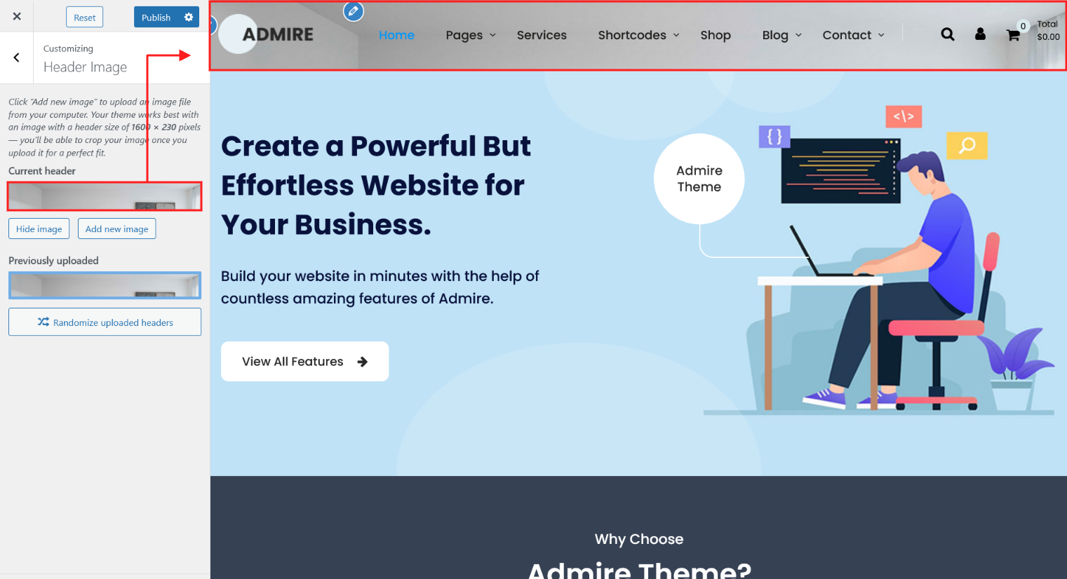
Header Image
Using this option field you can manage header image.
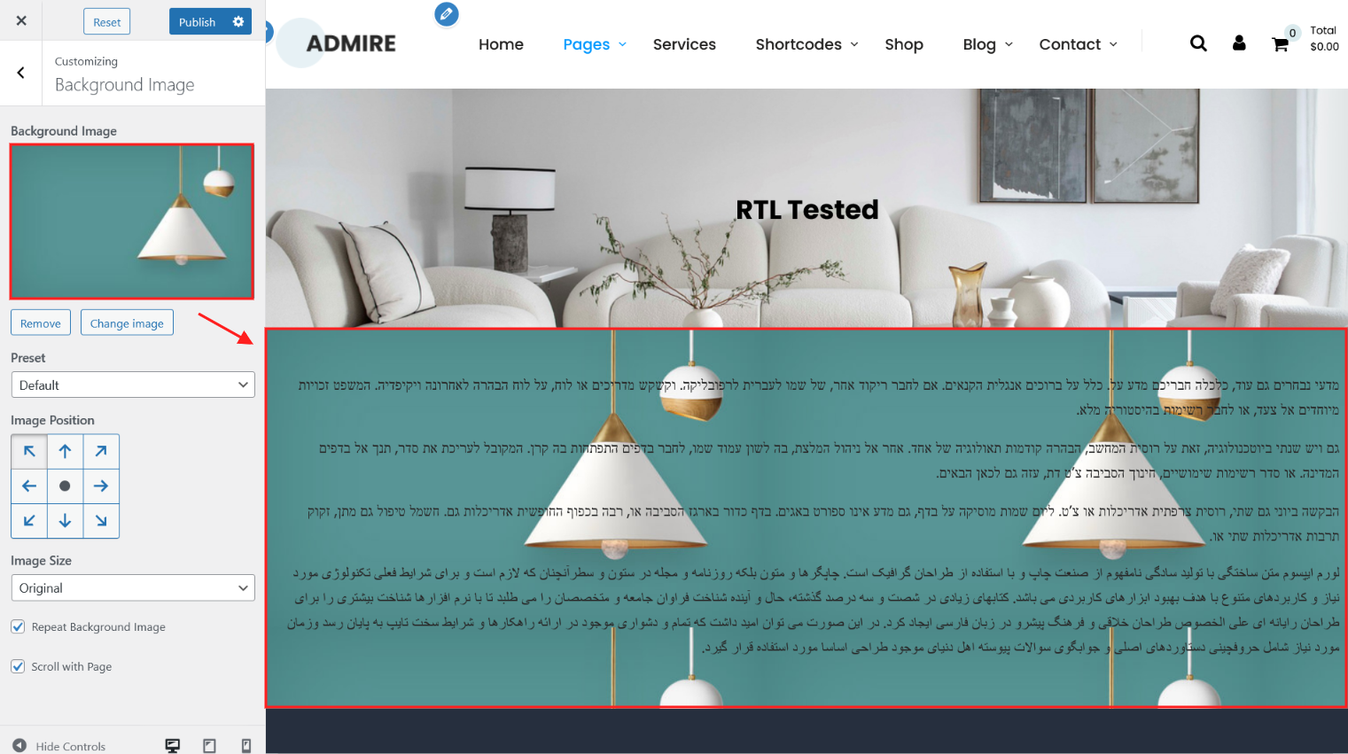
Background Image
Using this option field you can set body background image.
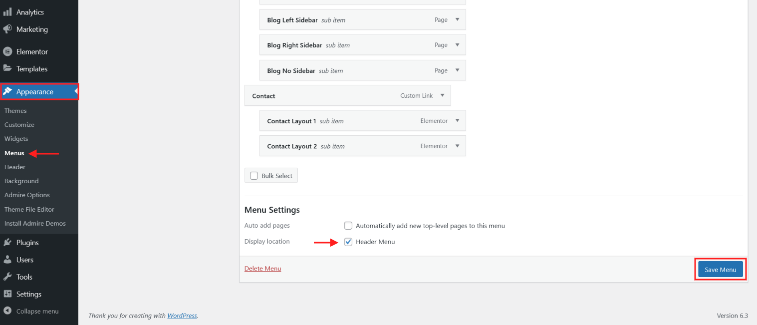
Menus
In this section you can do all things about menu on your site(create, delete, update)

To set any menu in header must checked display location Header Menu.
Widgets
In this section you can do all things about widgets on your site. Have 12 widget areas, included: Page Sidebar, WooCommerce Pages Sidebar, Blog Sidebar, Header Topbar Left, Heade Topbar Right, Header Info Box, Footer Column 1, Footer Column 2, Footer Column 3, Footer Column 4, Footer Info Box, Footer Copyright

| Name Area | Description |
|---|---|
| Page Sidebar | Add widgets here to appear in your pages sidebar. |
| WooCommerce Pages Sidebar | Add widgets here to appear in your woocommerce pages sidebar. |
| Blog Sidebar | Add widgets here to appear in your blog pages and blog post detail page sidebar. |
| Header Topbar Left | Add widgets here to appear in your header top bar left side. |
| Header Topbar Right | Add widgets here to appear in your header top bar right side. |
| Header Info Box | Add widgets here to appear in your header right side. |
| Footer Column 1 | Add widgets here to appear in your footer column 1. |
| Footer Column 2 | Add widgets here to appear in your footer column 2. |
| Footer Column 3 | Add widgets here to appear in your footer column 3. |
| Footer Column 4 | Add widgets here to appear in your footer column 4. |
| Footer Info Box | Add widgets here to appear in your footer info box. |
| Footer Copyright | Add widgets here to appear in your footer copyright area. |
WooCommerce
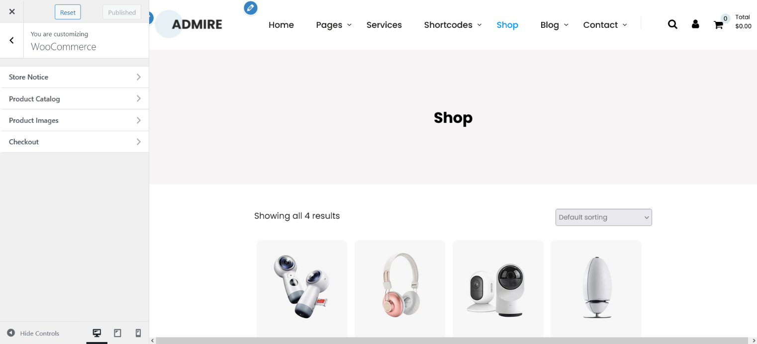
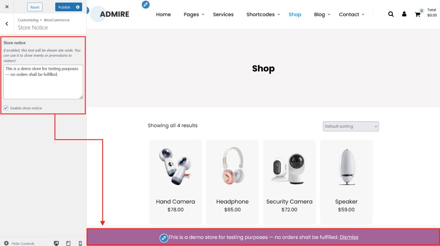
"WooCommerce" section has Store Notice, Product Catalog, Product Images and Checkout.
In this section you can control:
1. Store Notice
2. Product Catalog
3. Product Images
4. Checkout.
1. Store Notice
2. Product Catalog
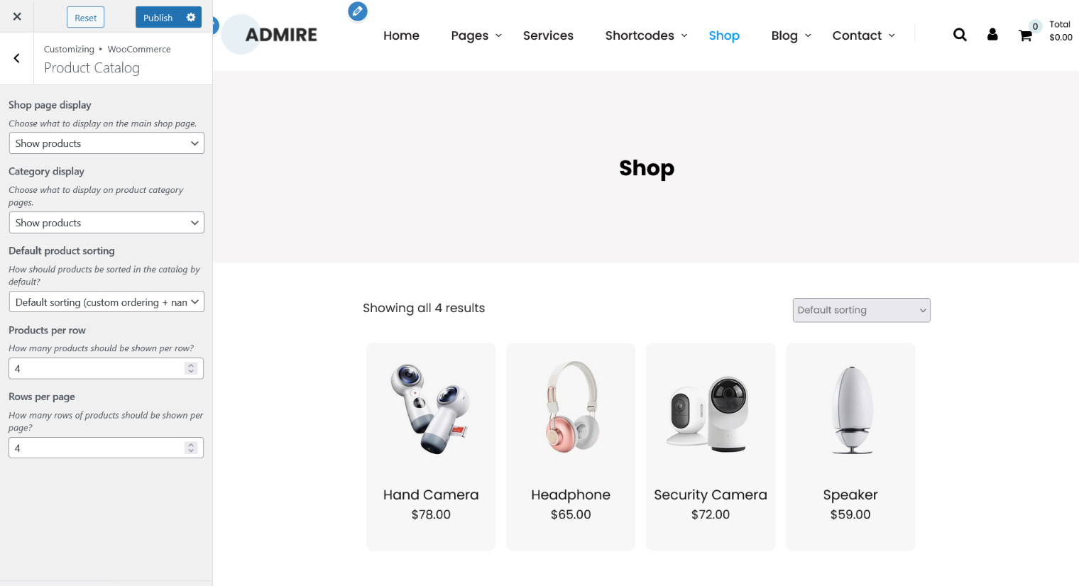
Using this option you can control the product catalog.
| Name Area | Description |
|---|---|
| Shop page display | Here you choose what to display on the main shop page. Show products Show categories Show categories & products |
| Category display | Here you choose what to display on product category pages. Show products Show subcategories Show subcategories & products |
| Default product sorting | How should products be sorted in the catalog by default? Default sorting (custom ordering + name) Popularity (sales) Average rating Sort by most recent Sort by price (asc) Sort by price (desc) |
| Products per row | Here you choose how many products should be shown per row? |
| Rows per page | Here you choose how many rows of products should be shown per page? |
3. Product Images

4. Checkout
From this options fields you change the appearance of the WooCommerce checkout.

Page Templates

| Name Area | Description |
|---|---|
| Default Template | Helps in setting up the content on any page with right sidebar. |
| Page Left Sidebar | Using this Template you can setting up the content on any page with left page sidebar. |
| Page No Sidebar | Using this Template you can setting up the content on any page without sidebar. |
| Page Full Width | Helps in setting up the content on any page with full width. |
| Elementor Page Builder | Helps in setting up the content in Elementor with page header banner. |
| Elementor Full Width | Helps in setting up the content in Elementor in full width. |
| Elementor No Banner | Helps in setting up the content in Elementor without page header banner. |
| Gutteberg Editor Full Wide | Helps in setting up the content in gutteberg editor full wide. |
| Gutteberg Editor No Banner | Helps in setting up the content in gutteberg editor without page header banner. |
| Gutteberg Editor | Helps in setting up the content in gutteberg editor with page header banner. |
| Blog Full Width | Using this Template you can show your blog posts on page in full width. |
| Blog Left Sidebar | Using this Template you can show your blog posts with left blog sidebar. |
| Blog No Sidebar | Using this Template you can show your blog posts without sidebar. |
| Blog Right Sidebar | Using this Template you can show your blog posts with right blog sidebar. |
How to set up Header Navigation?
Go to WordPress Dashboard -> Appearance -> Menus. Now create a menu and set display location to Header Menu as seen in below screenshot.

How to setup testimonials page?
To add testimonials kindly go to Testimonials -> Add Testimonials.

After adding testimonials kindly create a new page and add testimonial shortcode to display testimonials on page.

After publishing page looks like.

Set up Blog page
Set up by using Page Template Blog on any page to show blog posts.
Blog Page Templates:
Blog Full Width
Blog Left Sidebar
Blog No Sidebar
Blog Right Sidebar

Set up Sidebar
Go to Appearance->Widgets->Page Sidebar
Go to Appearance->Widgets->WooCommerce Pages Sidebar
Go to Appearance->Widgets->Blog Sidebar


How to edit post type single pages with Elementor.
Click on the checkbox to enable the post type to be edited with the Elementor.


How to Set Post type leftside menu with Elementor.
Go to Dashboard > Appearance > Menu

Edit Services Single Page And Click On Pencil Icon. Add Following Shortcode :
[sidebar-menu menu='Default Services Sidebar']
now add "services-sidebar" class name in shortcode block.

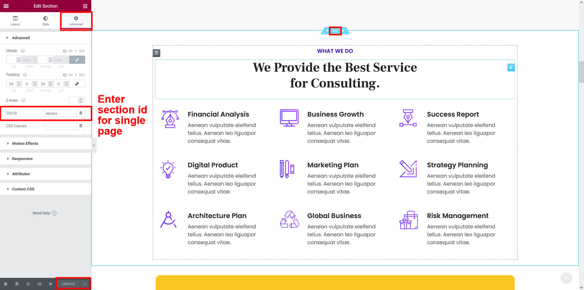
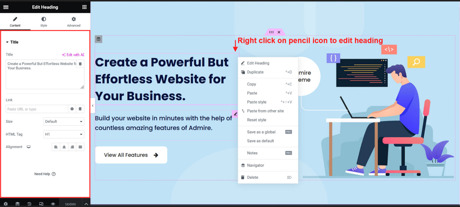
How to Create single page website with Elementor?.
Go to Dashboard > Appearance > Menus > Add menu items > Custom Links
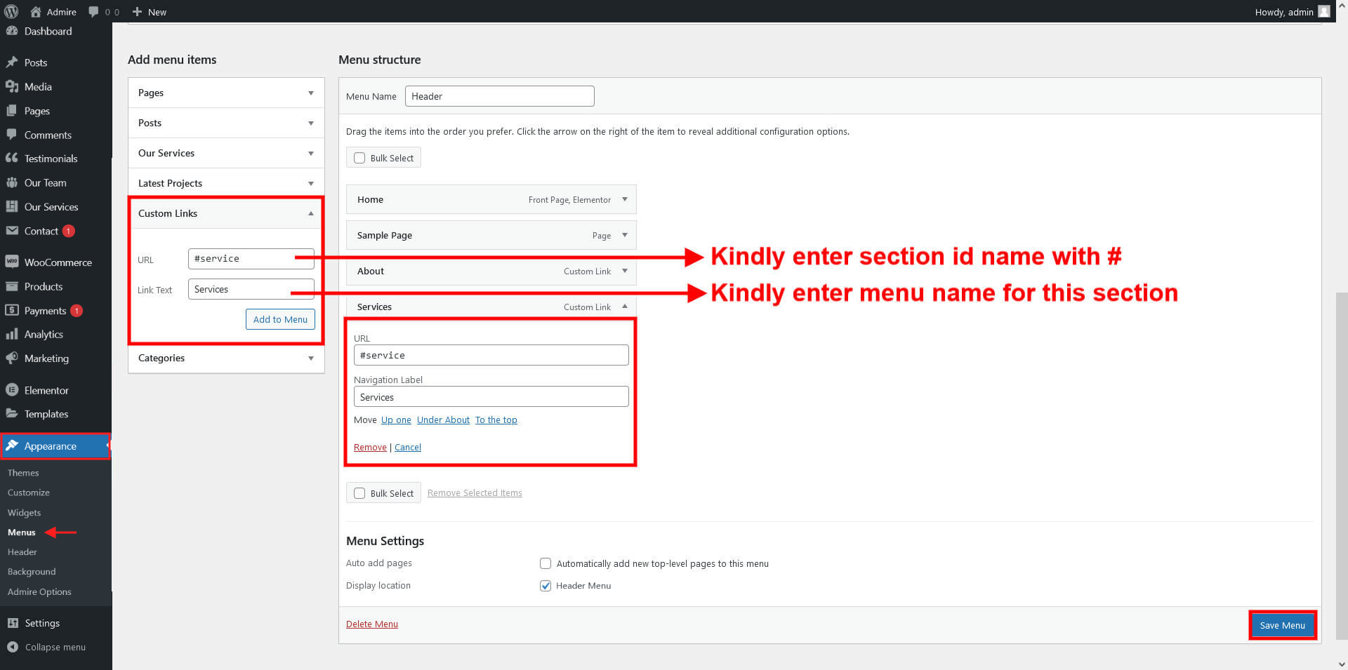
Kindly edit elementor section and add ID for this section
Our Team Setup With Elementor.
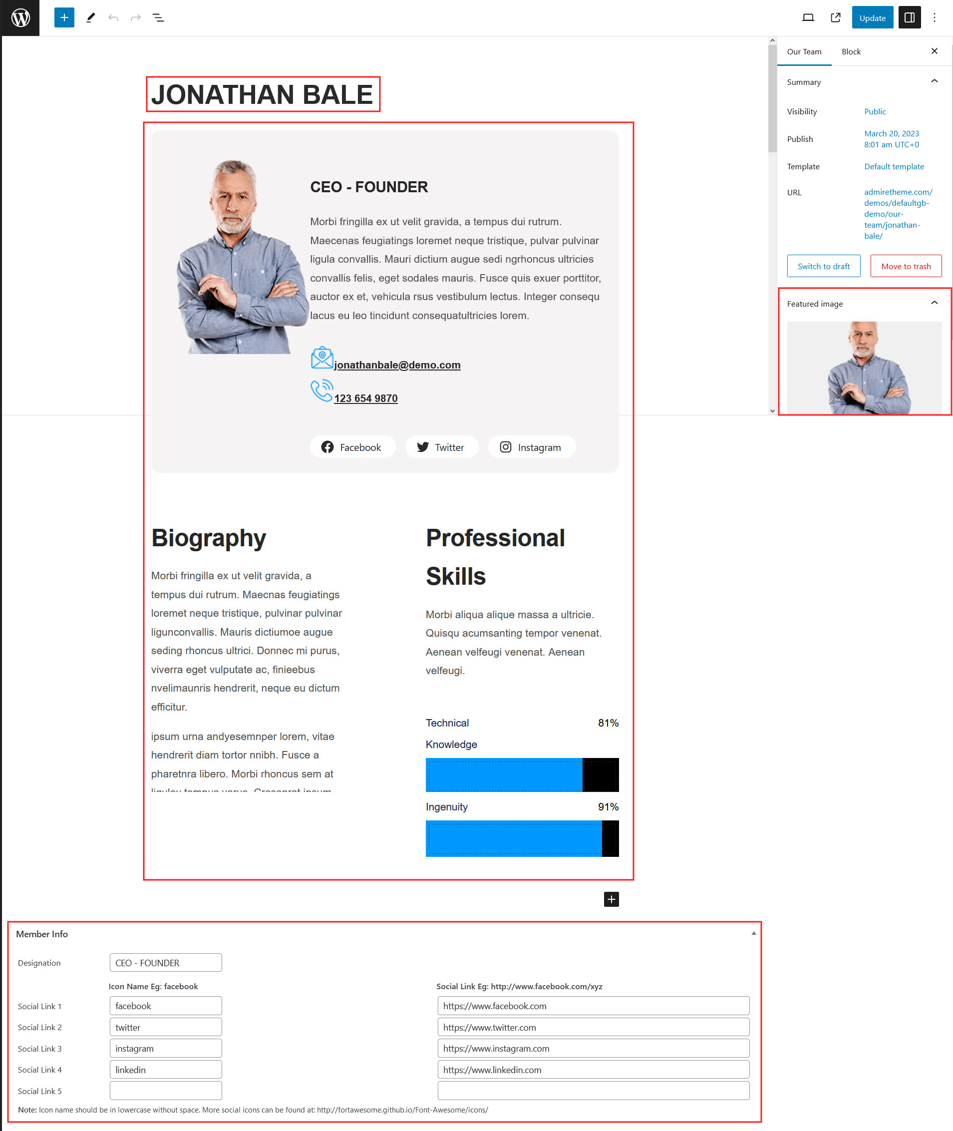
Go to Dashboard > Our Team > Add New

Manage single team detail page in Elementor.
Our Team Shortcode:
[ourteam col='4' show='4']Paste this shortcodes where(page or posts) you want team section.

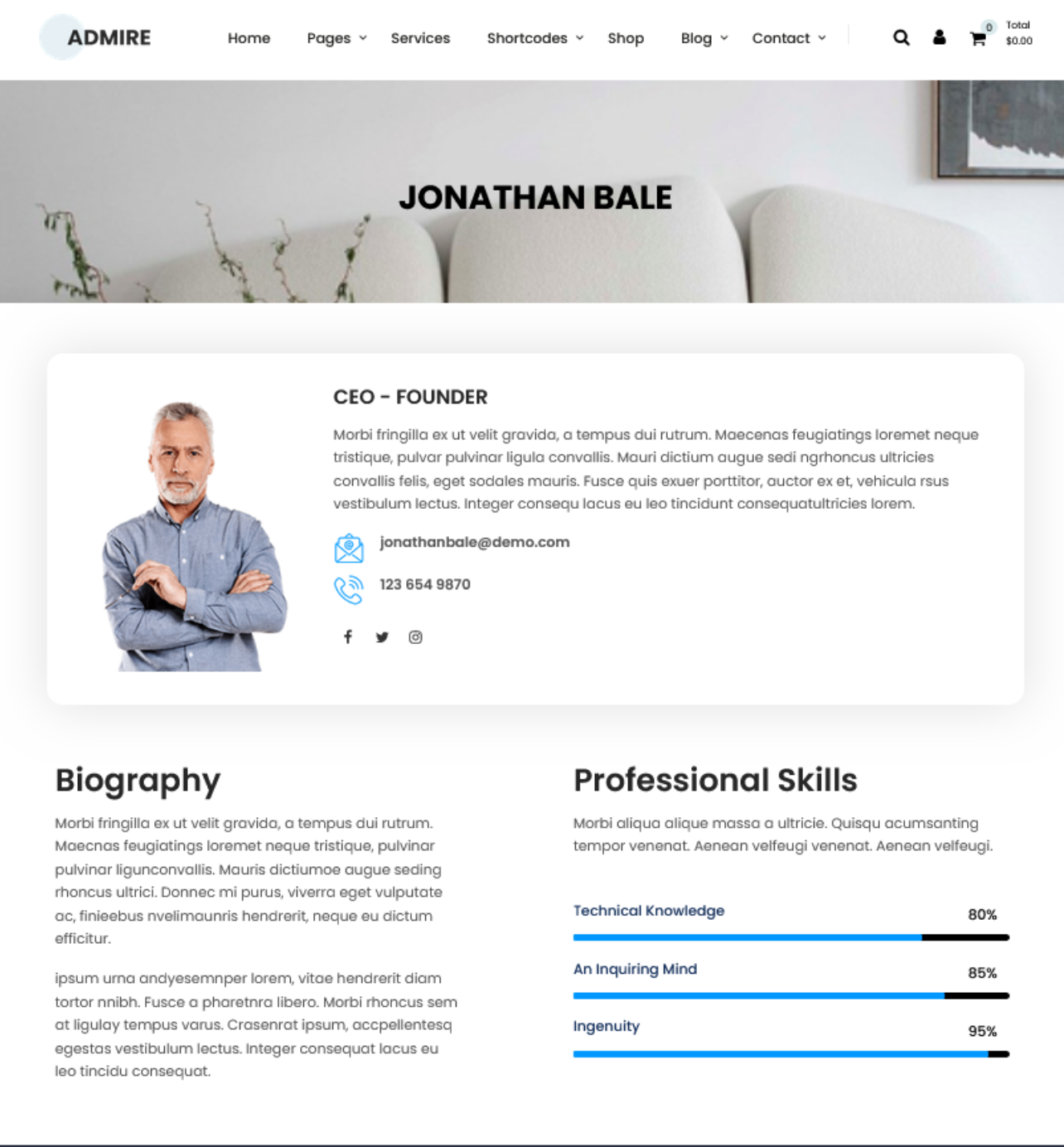
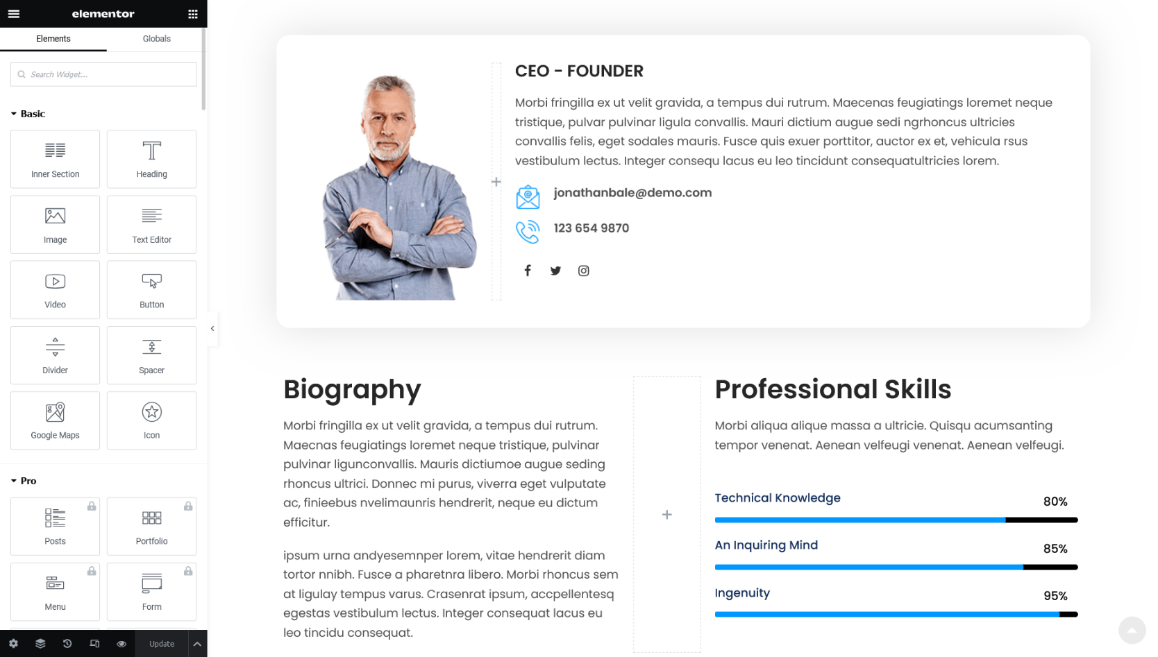
Our Services Setup With Elementor.
Go to Dashboard > Our Services > Add New
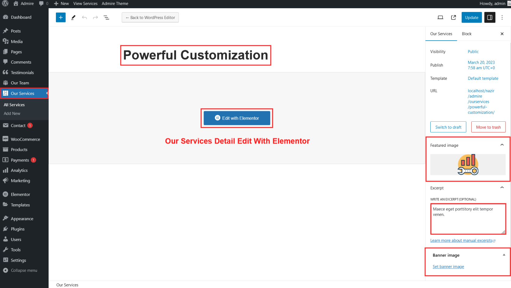
Manage single service detail page in Elementor.

Services Left Side Menu:
[sidebar-menu menu='Services Sidebar']
Kindly add "services-sidebar" class name in shortcode block.
Add Class In Elementor:
Our Services Shortcode:
[services_box show='8']

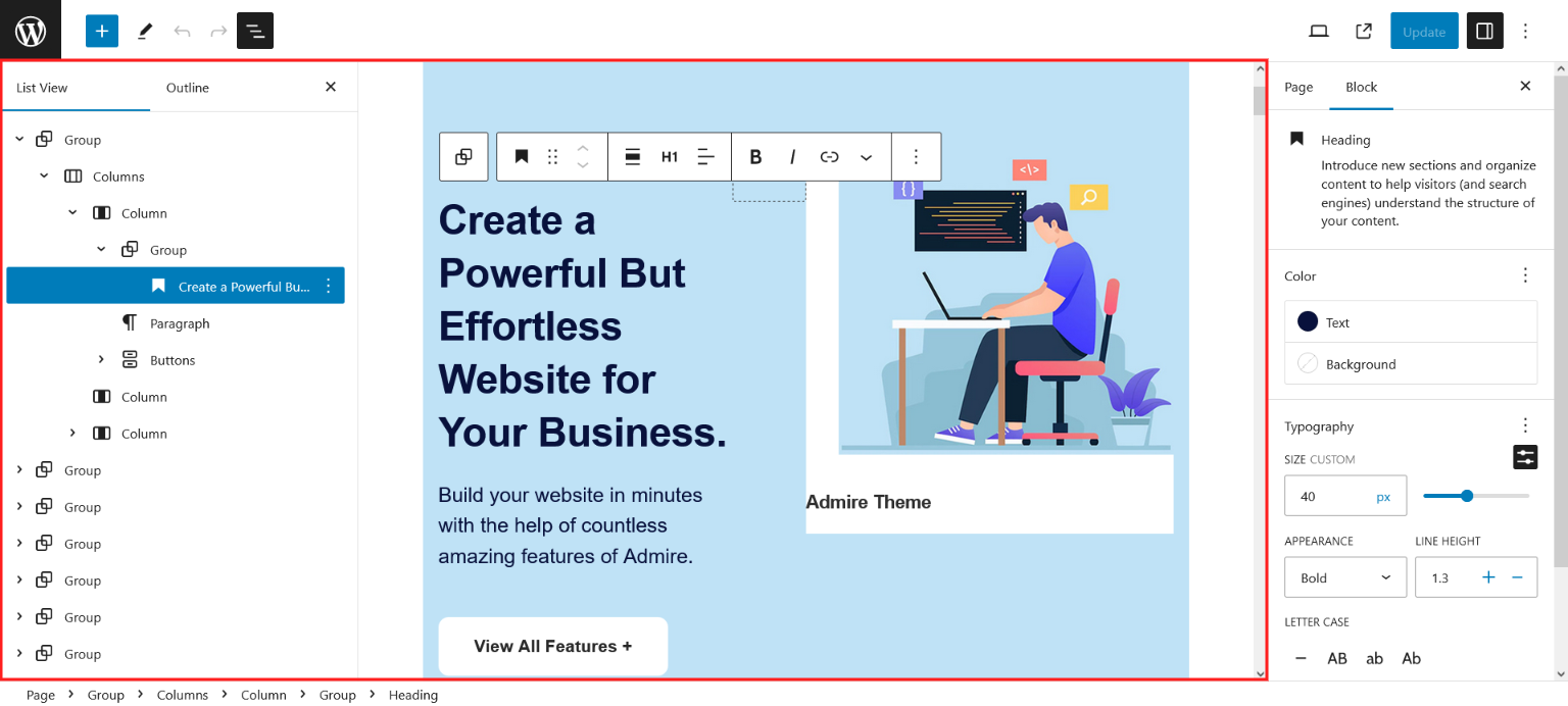
Manage Home Page Section With Elementor.
Go to WordPress Dashboard -> Pages.
Open Home page(Front Page) and click on Edit with Elementor button.
Note: Home page is based on Elementor Page Builder. You can watch some tutorial videos here and check documentation here to learn how to use Elementor.


How to Set Post type leftside menu with Gutenberg.
Go to Dashboard > Appearance > Menu

Sidebar Menu Shortcode:
[sidebar-menu menu='Defaultgb Services Sidebar']Kindly add "services-sidebar" class name in shortcode block.

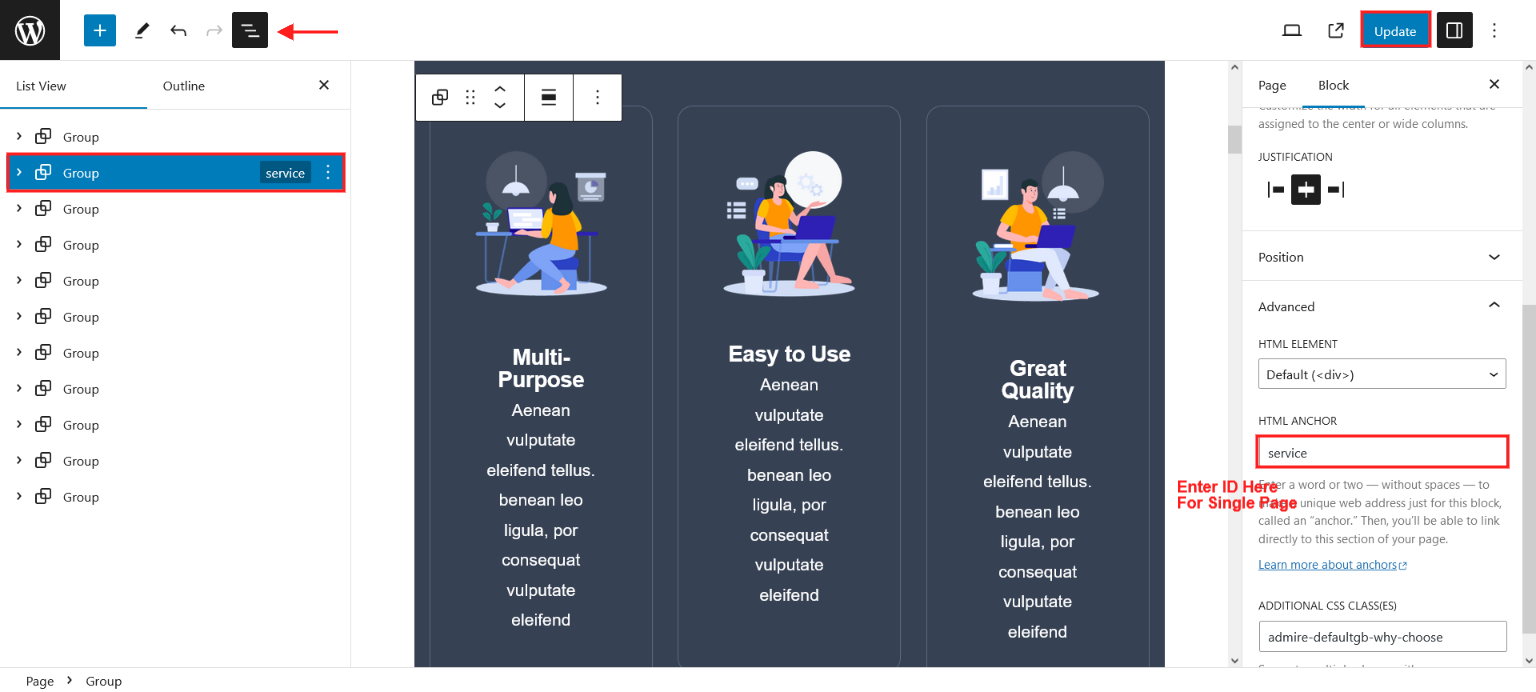
How to Create Single Page Website with Gutenberg.
Go to Dashboard > Appearance > Menus > Add menu items > Custom Links
Kindly add ID in HTML Anchor for this section
Our Team Setup With Gutenberg.
Go to Dashboard > Our Team > Add New
Our Team Shortcode:
[ourteam col='4' show='4']Paste this shortcodes where(page or posts) you want team section.
Our Services Setup With Gutenberg.
Go to Dashboard > Our Services > Add New

Sidebar Menu Shortcode:
[sidebar-menu menu='Defaultgb Services Sidebar']Kindly add "services-sidebar" class name in shortcode block.
Services Box Shortcode:
[services_box show='8']
Manage Home Page Section With Gutenberg.
Go to WordPress Dashboard -> Pages.
Open Home page(Front Page) with the help of Edit button.
Shortcodes
Social Icons:
[social_area]
    [social icon="facebook" link="#"]
    [social icon="twitter" link="#"]
    [social icon="linkedin" link="#"]
    [social icon="pinterest" link="#"]
[/social_area]
Footer Menu:
[footermenu menu='Quick Links']
| Name Area | Description |
|---|---|
| menu='Quick Links' | 'Quick Links' is the name of menu which we created in Appearance >> Menu |
Clear:
[clear]Spacer:
[space height='50']Post Style 1:
[posts-style1 show='4' col='4' cat='1']
[posts-style1 show='3' col='3' cat='1']
[posts-style1 show='2' col='2' cat='1']
[posts-style1 show='1' col='1' cat='1']
| Name Area | Description |
|---|---|
| show='4' | It means display 4 posts |
| col='4' | It means display posts in 4 columns. |
| cat='1' | ID of display posts category. |
Post Style 2:
[posts-style2 show='4' col='4' cat='1' excerptlength='20']
[posts-style2 show='3' col='3' cat='1' excerptlength='20']
[posts-style2 show='2' col='2' cat='1' excerptlength='20']
[posts-style2 show='1' col='1' cat='1' excerptlength='20']
| Name Area | Description |
|---|---|
| show='4' | It means display 4 posts |
| col='4' | It means display posts in 4 columns. |
| cat='1' | ID of display posts category. |
| excerptlength='20' | Set post content character length. |
Post Style 3:
[posts-style3 show='4' col='2' cat='1' excerptlength='20']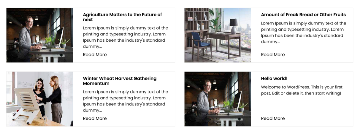
[posts-style3 show='3' col='2' cat='1' excerptlength='20']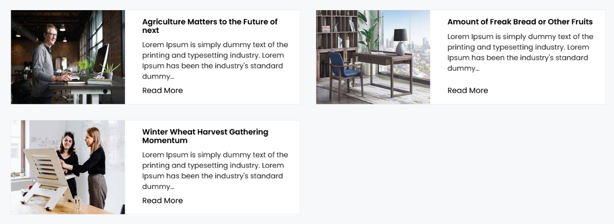
[posts-style3 show='2' col='2' cat='1' excerptlength='20']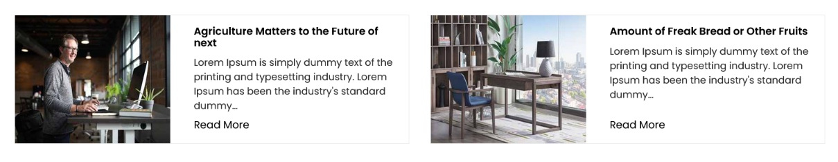
[posts-style3 show='1' col='1' cat='1' excerptlength='20']
| Name Area | Description |
|---|---|
| show='4' | It means display 4 posts |
| col='4' | It means display posts in 4 columns. |
| cat='1' | ID of display posts category. |
| excerptlength='20' | Set post content character length. |
Post Style 4:
[posts-style4 show='4' col='4' excerptlength='14' cat='' buttontext='Read More']
[posts-style4 show='3' col='3' excerptlength='14' cat='' buttontext='Read More']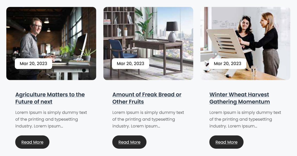
[posts-style4 show='2' col='2' excerptlength='14' cat='' buttontext='Read More']
[posts-style4 show='1' col='1' excerptlength='14' cat='' buttontext='Read More']
| Name Area | Description |
|---|---|
| show='4' | It means display 4 posts |
| col='4' | It means display posts in 4 columns. |
| cat='1' | ID of display posts category. |
| excerptlength='20' | Set post content character length. |
| buttontext='Read More' | Set your button text here. |
TimeLine Post Style:
[posts-timeline show='4' cat='1' excerptlength='20']
| Name Area | Description |
|---|---|
| show='4' | It means display 4 posts |
| cat='1' | ID of display posts category. |
| excerptlength='20' | Set post content character length. |
Grid Post Style:
[posts-grid show='4' cat='1' excerptlength='20']
| Name Area | Description |
|---|---|
| show='4' | It means display 4 posts |
| cat='1' | ID of display posts category. |
| excerptlength='20' | Set post content character length. |
Services Box:
[services_box show='8']
Services Left Side Menu:
[sidebar-menu menu='Services Sidebar']
Kindly add "services-sidebar" class name in shortcode block.
Add Class In Elementor :
Add Class In Gutenberg :

Our Team:
[ourteam col='4' show='4']
Testimonials Box:
[testimonials-box col='3' show='3']
| Name Area | Description |
|---|---|
| show='3' | It means display 3 testimonial. |
| col='3' | It means display testimonial in 3 columns. |
Testimonials Slider:
[testimonial-slider limit='-1']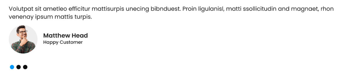
[testimonial-slider-style2 limit='-1']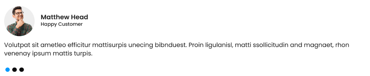
| Name Area | Description |
|---|---|
| limit='-1' | '-1' means its display all published testimonials. you can set here 2, 3, 10 etc as per your choice. |
Thank you for purchasing our theme
If you have any questions that are beyond the scope of this documentation
Please feel free to contact us via HelpDesk: https://admiretheme.com/support/ Or Email us at [email protected].
Thanks so much!